So, someone has finally convinced you that you need to start implementing an email marketing strategy. Or perhaps you’ve convinced yourself that your existing strategy could be a little more effective.
Either way, one of the first things you need to assess as you start this journey is the mechanism you use to grow your list of subscribers. We’re not going to talk about lead magnets in this article. The range of rewards you can offer your visitors in exchange for their precious email addresses is a very important topic that we’ve covered on a couple of occasions.
Firstly, we’re going to assume that the e-books, checklists, whitepapers, and discount codes you’re offering as incentives are sufficiently valuable to your target audience. Secondly, that you have the capacity to keep them relevant and exciting.
What we will be discussing in this piece is the structure and presentation that an email opt-in form can take. We’ll look at what other websites are doing and discuss why it works. User Experience is a critical part of conversion, and keeping an eye on trends in this space pays off.
Table of Contents
How to create an email opt-in form?
Communicate relevant value clearly
How to write an opt in email? It’s easy to forget that even a super compelling lead magnet may not be enough reason for someone to go through the effort and risk of divulging personal info online. As great as a discount maybe, some people just need to see the better value. What more can you tell them about their experience as a prospective customer that will nudge them towards opting in? Bay Alarm Medical understands it’s target market well enough to know what needs to be communicated - savings and the absence of risk.
The medical alert company shows a large exit-intent popup that’s elegantly populated with a ton of useful information covering these exact topics.
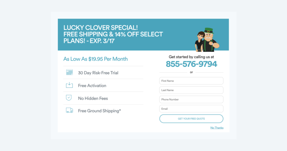
The layout of the popup is incredibly easy on the eyes, despite the amount of content, and the messaging is crystal clear.
You’ll receive a discount. You won’t pay for shipping. There is a lengthy, no-obligation trial period. We’re not going to surprise you with a bunch of unexpected expenses. As a result, your quote is free and won’t put you under any obligations.
This approach is effective for Bay Alarm Medical because it’s also aligned with the purpose of their flagship product. A device designed to keep people safe minimizes risk and consequently reduces anxiety. Remember that your lead magnet may not be enough. Ask yourself what additional value your target audience needs and then offer it very clearly.
Get quirky
This approach’s effectiveness is highly dependent on your brand’s relationship with its target audience. The last thing you want to do is inject a specific type of offbeat humor into a serious interaction. But, when done correctly and in a way that doesn’t detract from your primary message, a subtle visual joke could be a great way to prompt an email opt-in forms.
Now, this can be done with acute visual that has almost nothing to do with your brand’s core message, the way JOI went about it. The site’s exit-intent popup shows a photo of a toy dinosaur clearly surprised by the size of a giant human hand holding the company’s flagship product. A plant-based milk alternative.
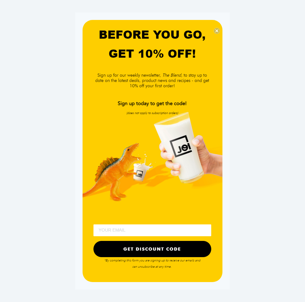
The accompanying text makes no reference to the adorable image and what it depicts, rendering the photo even funnier. The copy stays on-message, discussing the email opt-in form incentive clearly and concisely. Special mention should also go to the color scheme choices in the popup. Even though the bright yellow is used nowhere else on the JOI website, it’s perfectly complementary and makes a very cool contribution to the popup’s eccentricity.
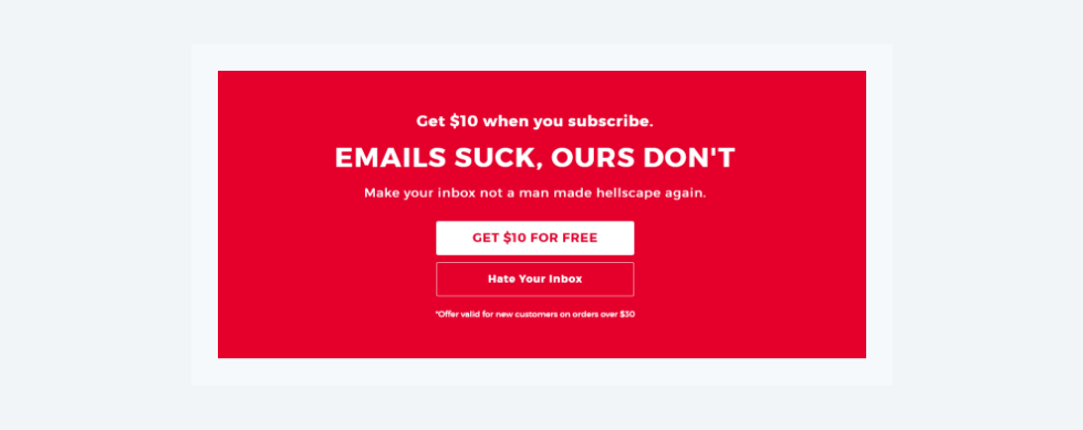
Another site that uses humor to great effect, albeit in a slightly less visual way, is Shinesty. On a simple monochromatic background, the novelty clothing brand known for its humorous marketing tone simply says what everyone’s thinking. Email marketing can be genuinely terrible if it’s not done right.
“Emails suck, ours don’t,” they proclaim. Simple, funny and to the point.
Keep things super-simple
Many sites choose to keep things uncomplicated and not get too pushy about asking visitors for their email addresses. Elemental Labs takes this approach to the extreme with their footer-embedded opt-in form. Aside from a button labeled “Stay Salty,” this opt-in form is as modest as a form can be - one line of text, one input field, one button. The main reason you may want to consider this level of simplicity is that a more in-your-face approach could be at odds with your company values.
Some brands are hesitant to give their visitors the impression that they’re merely a number in a marketing funnel because it clashes with the overall tone of their marketing messages. It’s not the image they want to sketch of themselves for their audience.
By keeping their email opt-in form’s messaging and design subtle, Elemental Labs isn’t trying to “convince” anyone to do anything. They’re letting their product speak for itself – a sentiment that’s consistent with their site’s entire UX.
SEO specialists, Moz, take a very similar approach to their opt-in form. While it may not compete with Elemental in terms of pure simplicity, there’s a reassuring lack of sales talk, promises, special offers, bells, and whistles.
In two sentences, the form communicates what the user can expect. It’s concise and direct without being sterile, and all they’re asking for is the one piece of info they need – an email address. Moz shows that elegant simplicity doesn’t have to mean a total absence of information. The information it provides can simply be extremely succinct.
Get interactive
Everyone loves to be a winner. And if parting with your email address is all that’s standing between you and the chance to bag a massive 25% discount, you may not even think twice. Especially if the gambling aspect is accentuated as elegantly as it is on Runners Athletics’ site.
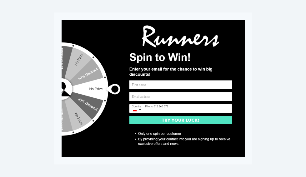
Launched only when the user clicks on a mysterious, but highly visible icon floating in the bottom-left hand corner of the screen, the Runners Athletics’ “spin to win” game offers an incredibly powerful incentive for visitors. Firstly, by “hiding” the game, the brand makes users feel like they discovered some secret part of the site. A virtual treasure that they were smart enough to locate.
Not labeling the trigger clearly is a risk, but it instantly triggers massive emotional buy-in from the visitor. They feel invested even before taking part in the game. Because finding the game was the first part of it. They’ve already got that behind them, they may as well go all the way now, right?
Secondly, spinning the wheel is made to look easy. There’s a comforting amount of reasonable terms and conditions – only two, in fact. All that’s required is for three fields to be captured and the “Try Your Luck” button becomes active.
The wheel spins for a satisfyingly long stretch of time. Then, the anticipation builds. The player’s discount is revealed and guess what. Claiming your prize is as simple as copying a discount code from the “outcome” screen. This approach works because its a smart combination of chance, exploration, and simplicity leads to a genuine emotional buy-in from the player.
Another site that’s been successful at making i’ts opt-in email campaign interactive is Cerries Mooney. The marketing consultant was smart enough to use an opt-in quiz that dovetails extremely well with her core service. Integrating her clients’ personas into their brand. Anyone who arrives at the site knowing what Cerries Mooney does will be interested in her process. And guess what. You don’t have to book a consultation to see it in action. All you have to do is take her “archetype test” to see what her service is about.
Mooney’s brand is all about the rewards of self-discovery and finding out how this process can be leveraged for success in business. So, the elegant way this interaction blends with her consultation service again prompts genuine emotional investment from the site visitor.
In all likelihood, someone who completed the quiz will be happy to share their email address to see the results. As a result, they will find out how these can be used for their business’ benefit.
Concluding remarks on the opt-in email campaign
As with any UX decision, the design of the opt-in form should keep the needs of the brand’s target audience in mind. Most companies will have an excellent idea of who they’re trying to attract to their site and who their ideal customers are. When creating an email opt-in form, it is vital that you keep these buyer personas in mind.
Ask yourself what kind of language speaks to them? What kind of visual messaging will appeal to them? How sensitive are they to risk or annoyance? At the same time, these opt-in forms should align with your company’s brand values and design aesthetic. Don’t simply copy an opt-in form from one of your competitors because it looks like it works.
In conclusion, think about the needs of your audience and where that overlaps with the things that make your brand unique. That’s the sweet spot for everything design-related on your site – including something as simple as an email opt-in form.

About the author
When Karl Kangur failed as a chess prodigy, he turned towards online business. He started his first business as a teen. He's since failed countless times, so his clients don't have to.