Despite the numerous alternatives available in 2023, email marketing remains one of the most effective strategies for engaging and converting customers. In fact, according to the 2021 Unbounce Conversion Benchmark Report, email as a distribution channel was almost 3x more effective than social media and 6x more advantageous than paid search in terms of converting leads. With this in mind, it's only natural that marketers should explore ways to use email more actively in their attempts to keep in touch with prospects. But the one prerequisite for doing so, at least successfully, is knowing how to compose a welcome email that sets you up for success.
Table of Contents
This article will examine the most common welcome email mistakes, exploring the best tactics to drive positive outcomes instead.
Top 10 Welcome Email Mistakes to Avoid
Skipping the Welcome Email Altogether
You can make multiple different mistakes when welcoming new email subscribers. Naturally, some of these will go completely unnoticed by your target audience, while others may negatively impact their experience with your brand.
However, if your goal with email marketing is to transform your leads into loyal customers, the number one thing you absolutely must do is write a perfect welcome email.
Remember, this message doesn't necessarily have to be long, feature intricate designs, or even play a role in onboarding long-term customers.
However, it should show that your business cares about providing every single lead with a positive experience and making a solid attempt at leaving a positive first impression on new email subscribers (which has been scientifically proven to increase satisfaction and loyalty amongst consumers).
Forgetting to Say Thank You
As mentioned above, first impressions are everything — in life and business. So, if the first thing your potential customers receive from your brand is an offer convincing them to spend their hard-earned money, they'll likely perceive your business as only trying to sell.
However, if you take the time to thank your subscribers for signing up for your newsletter, you'll immediately position your organization as one that cares about its customers. Moreover, it will underline that your brand always puts customer satisfaction before profits, which is an excellent way to build customer trust.
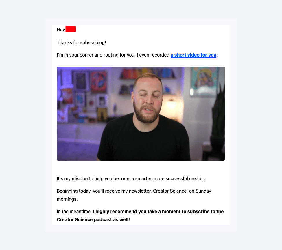
From a practical point of view, there are two ways to thank new subscribers for connecting. On the one hand, your welcome emails can be as straightforward as saying "Thanks for subscribing," followed by a few handy pieces of information about your newsletter. This is what Creator Science does as part of its welcome strategy, which you can see below.
On the other hand, you can transform your welcome emails into the start of a habit by ensuring that they include a reward to help your leads associate interactions with your brand with positive feelings.
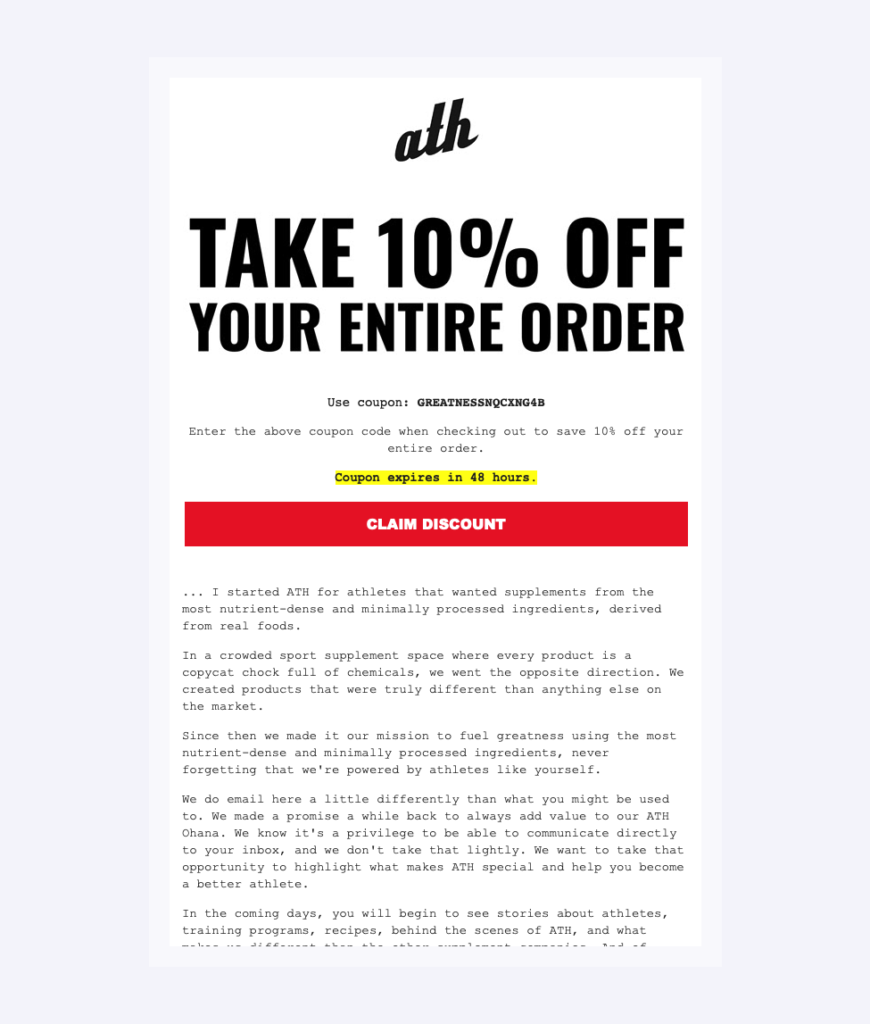
This can be as simple as saying, "You are awesome for having become a part of our community." Alternatively, it can be more customer or conversion-oriented by providing new leads with a discount code they can use for their first purchase, as done by ATH below.
Not Setting Clear Expectations
One of the most effective ways to keep email subscribers (and customers) happy is to practice expectation management. Ultimately, when consumers know what to expect, they are:
- More empowered to make choices that align with their needs, guaranteeing higher customer satisfaction. And;
- Less likely to become disillusioned by brands not delivering a benefit they thought they'd be getting.
So, to keep new and old subscribers happy, you must ensure that your welcome emails (as well as your newsletter sign-up forms) set clear expectations from the first interaction.
Tell subscribers what value they can expect from your brand, how often they will receive emails, and how they can manage their subscription preferences. This will ensure they're not over or underwhelmed by your email marketing campaigns and will genuinely enjoy reading your newsletters instead of sending them straight to the junk folder.
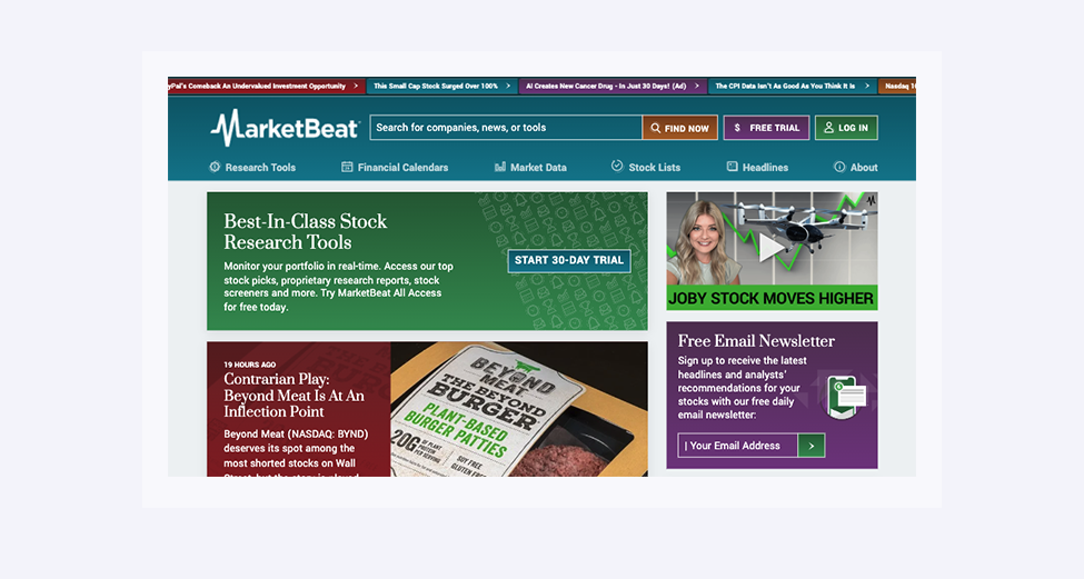
For instance, if you check out the MarketBeat homepage, you'll see that the Daily Ratings Newsletter subscription section promises headlines and analyst stock recommendations delivered daily. And to ensure that leads understand that they control their inbox (including how often they get emails and about which topics), the brand also includes a four-part setup guide in the welcome email to help subscribers get the most out of the newsletter.
Another thing you must do to prevent your emails from becoming a part of your junk folder is to keep things to the point. Average consumers won’t read lengthy chunks of text. So, condensing information and making it easily readable is the way to go. An advanced text summarizer can help you with that. It will understand the intent of the text and make it as short and simple as possible without missing any highlights that are important for consumers.
Poorly Written Subject Lines
In 2021, the open rate for automated welcome emails was 30.45%. And, sure, these results aren't catastrophic (or lagging behind regular email marketing open rates, for that matter). Nonetheless, they still leave room for improvement.
Fortunately, there's a relatively easy fix: learning to write more compelling subject lines.
For example, instead of saying something like, "Welcome to the [insert brand name] newsletter," consider whether asking a question or quoting a statistic in email subject line would be more effective at encouraging your prospects to interact with your welcome email.
McKinsey is a great organization to emulate when composing subject lines. In the example below, you can see how effectively the brand uses a widely-known statistic, suggests that it has some new and unexpected data, and adds a dash of interest with the message preview reminding subscribers not to blink.

Naturally, you won't necessarily be able to recreate this same effect for welcome emails. You'll need creative solutions geared toward welcoming and onboarding subscribers.
However, by ensuring you do your best to delight and engage your audience, you'll achieve better results than brands still opting for worn-out phrases for their welcome emails.
Lack of Personalization
According to research from 2021, 71% of consumers expect brands to deliver personalized experiences, and 76% get upset when this doesn't happen. So, if you want to avoid common welcome email mistakes and guarantee that new subscribers have a super-positive impression from their first brand interaction, explore ways to add a personal touch to your emails.
The easiest way to do this is, naturally, to ask for a name during the sign-up process, which will help you compose emails that speak to a person, not just the idea of a potential buyer.
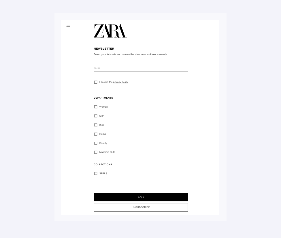
However, you can go even further with personalization in your welcome emails — especially if your marketing team runs multiple campaigns.For instance, if you look at brands like Zara, you'll see that they ask new subscribers to tick the product options they're interested in, which is a smart way to prevent spamming your audience with irrelevant content.
Boring Design
Visuals play a huge role in helping your prospects remember and like your brand. And to ensure that your email marketing campaigns actively contribute to your business' success, you need to make them visually appealing. Especially when trying to leave a positive first impression.
Research shows that 59% of consumers prefer to consume content that's beautifully designed than that which is bland. So, keep this in mind when putting together welcome emails, as a pretty visual or an attractive layout might help ensure that your audience doesn't regret hitting the "subscribe" button.
Of course, when considering design directions for your welcome emails, you don't have to go over the top to impress your audience. Generally, you'll do well enough by adhering to a few design principles:
- Staying consistent with your brand's visual identity.
- Ensuring sufficient contrast between the text and the background to promote readability.
- Sticking to an attractive color palette that reflects your brand's mission and values.
- Using photos and illustrations to support value propositions.
- Adopting the minimalist design approach to ensure high-value elements like CTAs stand out.
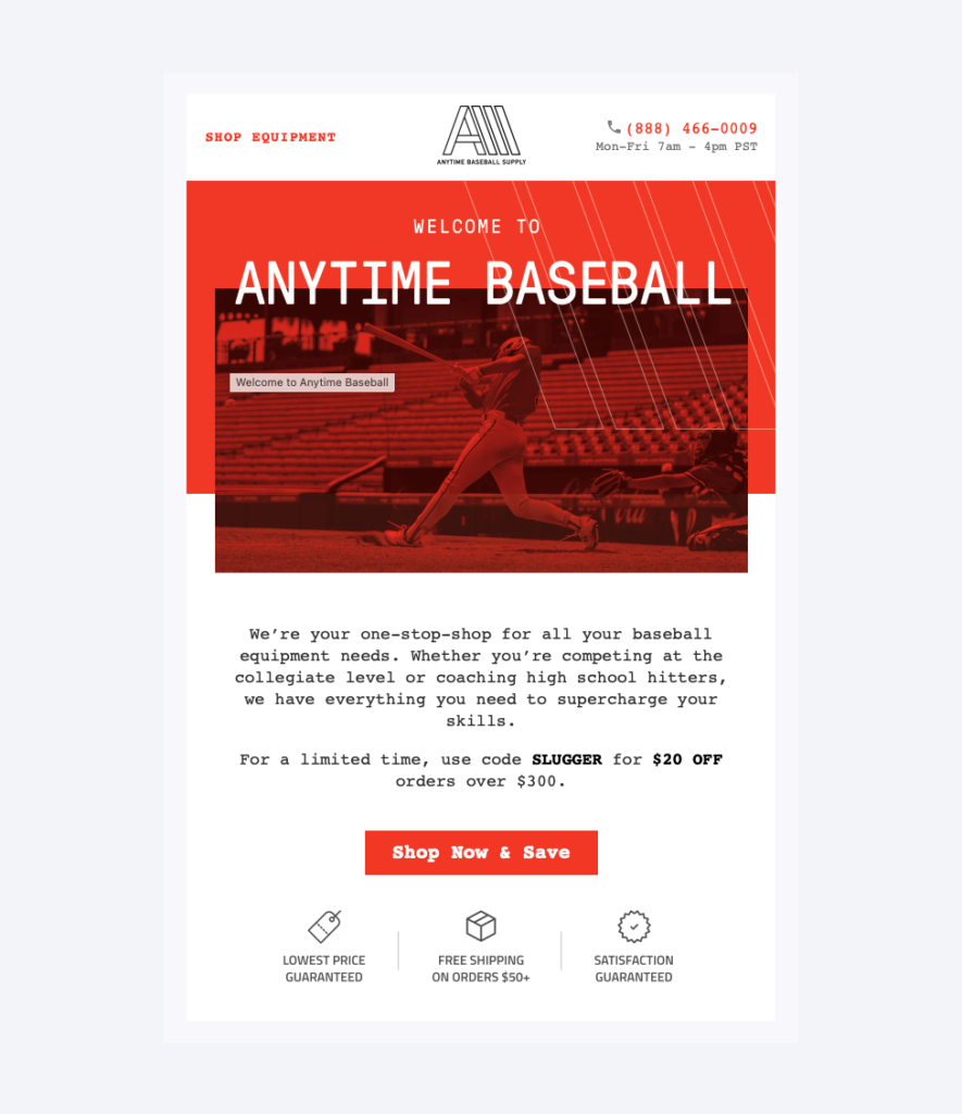
If you check out the Anytime Baseball Supply welcome email, you'll see just how effectively it implements these design principles. In addition to the attractive white, red, and anthracite color palette, the brand also enhances the message with professional-grade photos of the products it sells, as well as illustrations that highlight unique value propositions like free shipping and price guarantees.
Skipping CTAs
Creatives and marketers often agree that rules are meant to be broken. But while coloring outside the lines may work for attracting your target audience or getting them excited about your offer, there's one marketing rule that you should never break: including CTAs in your welcome emails.
Skipping calls to action is, basically, a super-effective shortcut to wasting your marketing budget.
Ultimately, when you develop your welcome email strategy, you must do so with specific goals in mind. Maybe you want to convert prospects into buyers. Your objective might be to nurture first-time customers into long-term users of your solutions. Or, maybe, you want to connect with your audience and use email to keep your brand (and products) at the forefront of their minds.
But, no matter which of these marketing goals you're trying to reach with email, you need to understand that the only way to do these things is to follow a three-step process:
- Grab subscribers' attention with a catchy subject line and engaging content.
- Get them to act — like navigating to your blog, checking out products in your ecommerce store, or interacting with you on social media.
- Deliver sufficient value on the landing page to achieve a conversion.
Now, this process might seem straightforward. However, as soon as you remove step no. 2 — which is what CTAs do in the first place — you're making it impossible to reach your goals.
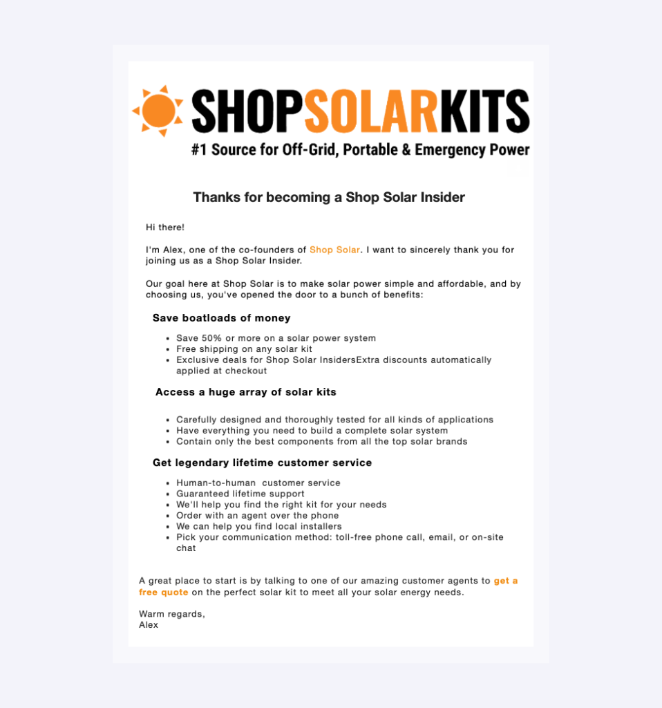
For this reason, when composing welcome emails, ensure they don't end with saying, "Thanks for subscribing." Instead, use CTAs to push your leads towards further interactions — especially while your brand and value proposition are still fresh in their minds and have the potential of leading to a conversion.A solid example of how one business does this comes from ShopSolar. In its welcome email, this business invites prospects to "Save boatloads of money. Access a huge array of solar kits. Get legendary lifetime customer service." But, while these value propositions do an amazing job of inspiring consumers to act, imagine just how much more effective they could have been if the "Get a free quote" CTA had been positioned in the format of a button instead of just a hyperlink within a long sentence.
Bad Timing
There's plenty of research on the best moment to send a marketing email. The best time to send email varies based on your industry, your audience's location, and what you're trying to achieve.
However, when it comes to welcome emails, the rules are pretty straightforward: the best time to send them is immediately after your subscribers opt into receiving communication from your brand. Otherwise, you've missed your chance to impress them and get them to commit your brand to memory.
Only Sending One Email as Part of the Onboarding Process
As you endeavor to avoid common welcome email mistakes and create an onboarding training process that genuinely benefits your brand, you must understand that consumers never go from awareness to conversion in a single interaction. On the contrary, they almost always move through the sales funnel gradually, with research showing that a sale requires an average of eight touches.
With this in mind, one effective tactic that could help you turn your welcome emails into conversion drivers is to facilitate the necessary interactions that will gently nudge your prospects toward the bottom stages of the sales funnel.
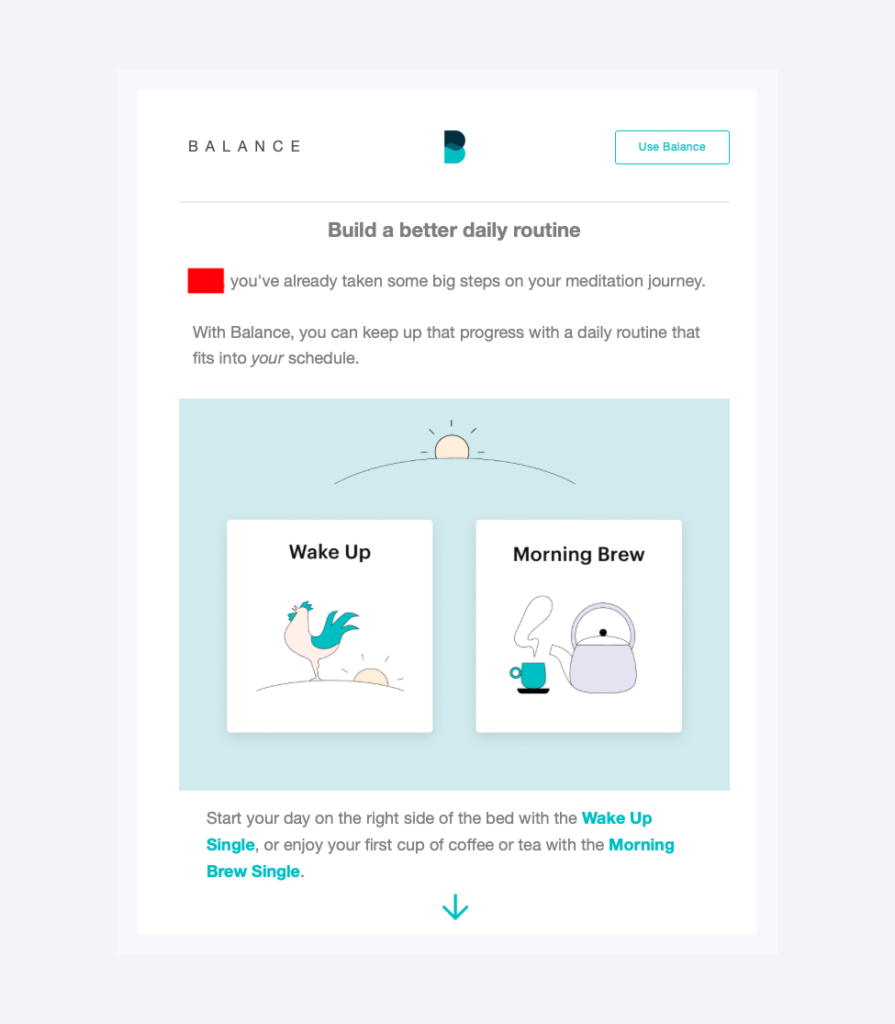
In simpler terms, consider whether your message could be better conveyed by breaking up your welcome campaign into multiple emails delivered over a week, month, or even year.For a great example, check out the onboarding campaign created by Balance. The brand presents new app users with a new email every morning, each describing a single step toward learning to meditate. And while it is true that adopting this approach could translate into a bigger delay between a sign-up and a conversion for some brands, it's also important to note that it allows consumers to experience the unique benefits a solution offers, maximizing their chances of becoming paying customers.
Not Conducting A/B Tests
Lastly, as you consider the welcome email slipups you must avoid, remember that the best way to make any marketing decision is to base it on data. And the tool that will help you collect that data? A/B tests.
Split testing is an excellent way of gauging your subscribers' reactions to content and design changes, seeing that it gives you the option to measure KPIs based on incremental tweaks.
For instance, if you're unsure whether a certain layout works or if your copy resonates with your audience, an A/B test can help you pinpoint the elements that achieve better results with your leads. This will provide your marketing team with a solid, data-based guidepost for creating welcome (and any other) emails that will delight your audience. And more importantly, it will prevent you from sticking to email marketing practices that don't resonate with your prospects, allowing you to make necessary changes and improve your overall ROI.
In Closing: How to Avoid Welsome Email Mistakes
There you have it, the ten common welcome email mistakes you must avoid, along with some tips on what to do instead.
As you can see, none of these tricks require you to be a marketing genius or to have a bottomless email marketing budget. Instead, they're intelligent and simple ways to ensure your hard work translates into results, which you will surely see, regardless of whether you're measuring open rates, click-through rates, conversions, or overall ROI.


