Email marketing is an art and science that works on certain tactics and principles.
It's not simply "feeling out" the recipients and hoping that they will enjoy your content. You need to find a way to figure out what makes your customers click on your emails more. The best way to build an effective email marketing strategy is to figure out what resonates the most with your subscribers and incorporate the same in your email communications. A/B testing is a powerful technique to understand customer psychology and enhance your email campaign performance.
Table of Contents
- What is A/B testing?
- The objective of A/B testing
- How does A/B testing work?
- Elements to A/B test
- Points about A/B tests to keep in mind
- Wrapping up
What is A/B testing?
Email A/B Testing or split testing is the process by which you can send an “A” version of your email campaign to one segment of subscribers and a “B” version to another set of subscribers. A more advanced variation is A/X testing that works on the same principle - the only difference is that with A/X testing you get to send multiple different emails. However, it also means that it's more complicated to verify, as, with multiple different changes, you can get a bit lost and ultimately learn less, than with regular A/B testing.
The objective of A/B testing
The primary goal of A/B testing is to determine what kind of emails drive better open rates and click-through rates. Often, marketers see a spike in the number of unsubscribes or a sharp dip in the open rate. In such a scenario, you can consider testing two different email campaigns against each other to see how they are perceived by the recipients.
How does A/B testing work?
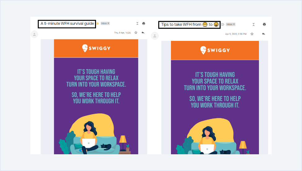
A/B testing can have different levels of complexity -they can either be simple A/B tests or advanced A/B tests. While simple A/B tests refer to sending emails with one variable element, advanced A/B testing means testing two completely different email templates. For instance: The folks at Swiggy have sent two emails with different subject lines in order to get an idea of what kind of subject lines can work better for them. It can be presumed that they have tried to test the effectiveness of emojis too, through this split test.

If you are using a tool like Elastic Email, you can run an A/B test in 6 easy steps as described below:
- Click on Create Campaign on your campaign screen.
- Pick the contact list to whom you want to send the campaign.
- You can either create the first template for your campaign or select it from the existing ones.
- Next, you will be able to see a new option “Add A/X”. After selecting it, choose the next template for your campaign or create it.
- There will be a separate tab like a, b, c, etc. on all the templates that you choose. You can then update the email elements according to your campaign. You can have your subject line, from name, from email address, email CTA, preheader text and email copy as the A/B testing variables.
- Go to the Settings & tracking option and set the send time options, tracking and split optimization.
You can test your A/B split campaign for two results, namely opens and clicks. As a part of the first optimization period, the template variants will be deployed to 10% of the selected subscribers. One subscriber will receive just one template. According to the results of this campaign, you can send the winning template to the remaining 90% of your contacts.
You will be able to see the performance results on the Activity screen of the campaign, as shown in the screenshot below.:

Just keep refreshing the campaign screen so that you get instant updates on the results.
Elements to A/B test
Starting from the “from : name” to the copy, visuals, and CTAs, you can A/B test every aspect of your email campaign. Think of it that way - if you can change it, you can test it. Let’s see some of the examples and elements you can test in your emails.
1. Subject line
Whenever your subscribers receive an email, the first thing that will draw their attention is the email subject line. Most of the recipients will decide whether or not to open your email based on this. So, what can you test in the subject lines?
- Length
While it is advisable to have short subject lines with 61-70 characters, you must consider testing the subject lines. If you have more subscribers accessing your emails through mobile devices, you should consider having fewer characters in the subject line. One way to shortening your subject lines is to add an emoji that will convey the emotion of an email or replace the word altogether. Keep in mind though, that using emojis can be a tricky business so it's best to get some additional knowledge before you start.
- Personalization
Most of the businesses are using personalized subject lines to cut through the noise in the inbox. Figure out whether this trick works better for your brand. If your ESP or CRM has the subscriber’s name in the database, add it to the subject line and monitor the email analytics. A higher open rate would naturally mean that personalization is more effective for your email campaigns. To add a name without much hassle, you can utilize a merge field feature and have your work cut out for you.
- Subject line copy
There are so many different ways in which you can announce your 50% Off sale through the subject line. For instance:
FLAT 50% OFF - Offer Valid While Stock Lasts
Your 50% OFF Discount Code Inside
While the first subject line would promote the sale and create a sense of urgency for the recipient, the second subject line directly talks about what the subscriber can expect in the email. It is convenient to assume that the first one would bring better results, but you can A/B test and see for yourself what works for your brand and audience.
2. Email copy
How unfortunate is the fact that our attention spans are constantly dwindling and they have reached eight seconds, which is even lower than that of a goldfish. As a result, you cannot cramp up your emails with a wall of text. You must be as concise as possible. Here are some of the elements you can test:
- Tone
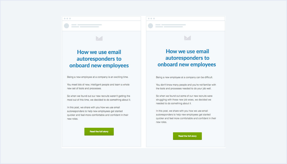
The most important aspect of your email copy is its tone. According to multiple studies, positivity in the copy engages the subscriber’s mind much better and entices them to take action. It's a common practice in every communication, proving that people respond more positively if the person (or brand) that communicated with them, has a positive attitude as well.
Take a look at the example below:

- Length of the copy
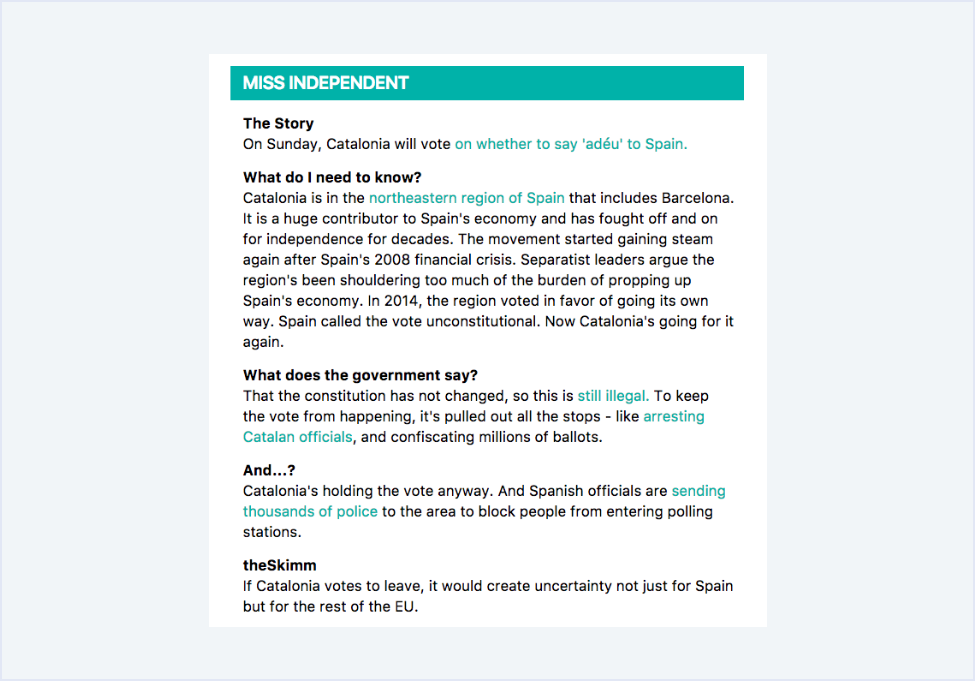
Many companies like theSkimm have tried longer emails and it has worked pretty well for them.

On the other hand, brands like Duolingo follow a minimalistic email layout with ample white space.

You can A/B test and ascertain whether your customers like to read long emails or shorter ones.
- Personalization
Like subject lines, you should test personalization in the email copy too. Try A/B testing by including details like the subscriber’s name and geographical location in the email copy. If you are from the ecommerce sector, you can add information about past purchases and send product recommendations accordingly.
3. Visual elements
Using images can take your email campaigns to the next level. You can A/B test the usage of images and rich media like GIFs, cinemagraphs, and videos in your emails. If you are a SaaS company, you can test whether explainer GIFs work better for your subscribers or embedded videos. Similarly, e-commerce companies can compare the effectiveness of multiple images and GIFs. You can also give a shot to minimalistic emails and see how they work for you. After all, less is more sometimes.
4. Call-to-action
The call-to-action is one of the most important elements of any email as it has a deep impact on your conversion rate. The more actionable and enticing your CTA is, the better the chance of a conversion. Here are some aspects that you should test when it comes to the CTA button.
- Placement
Place your CTA in the first fold to get maximum attention from your subscribers. Alternatively, you can test placing more than one CTA in the subsequent folds of the email. You can also try text links in your email and see if it gets the desired click-through rate.
- CTA Copy
A/B test first person narrative and second person narrative in your CTAs. You can also test different actionable verbs like Submit, Shop, Buy and Try to name a few.
- Color of the CTA button
According to the layout of your email and color scheme, you can test the color of the CTA buttons. Also, consider your brand personality and industry before deciding upon your CTA color. Colors like red, green, blue, and black are the most commonly used colors for the CTA button.
5. Email send time
Honestly, Google does not have the answer to the best time to send your email. You must A/B test different timings, days of the week, and frequency to figure it out. While weekends would work well for recruitment emails, Tuesdays might work well for SaaS companies.
Points about A/B tests to keep in mind
- Make sure your sample size is large enough to render a statistically significant result from the A/B tests.
- Test your automated and transactional emails too, along with promotional emails and newsletters.
- Focus on the elements that are most likely to impact the overall campaign performance for your brand.
- It is better to test one thing at a time to get a clear idea of how it influences the subscriber engagement.
- Set a clear hypothesis and do not make any random changes to the campaigns.
- Pick a testing metric that is in sync with the goal of your email campaign.
- Choose the test audience with similar (and active) subscribers to avoid any skewed results.
- Let the marketing professionals handling different digital marketing channels know of the results.
Wrapping up
If you are following all the email marketing best practices but missing out on A/B testing, you are not using email marketing to its maximum potential. Just follow these tips and you will surely be able to yield better benefits from your campaigns without burning a hole in your pocket.


