You've spent time crafting a subject line that gets opened, a layout that guides the eye, and a CTA that converts. Then your subscriber reads it in dark mode, and your white logo disappears into a dark background, your carefully chosen color palette inverts into something unrecognizable, and the text is barely readable.
Dark mode emails are no longer a corner case. It’s the default preference for a growing majority of your audience. Designing only for light mode means designing for a fraction of your list. Another challenge is that email clients handle dark mode inconsistently, so there’s no single fix that works everywhere. But there is a systematic approach that does.
This guide covers everything you need to know about designing emails for dark mode. We’ll talk about why it matters, how different email clients handle it, the design and coding techniques that actually work, and how to use Elastic Email’s tools to build dark mode best practices into every email you send.
Table of Contents
- TL;DR: dark mode email in 2026
- Why does dark mode matter more than ever?
- Why do people prefer dark mode?
- How different email clients handle dark mode
- How to design emails for dark mode
- Coding dark mode emails - the technical side
- Designing dark mode emails with Elastic Email
- Designing email for dark mode - conclusion
- FAQ about dark mode email
TL;DR: dark mode email in 2026
- Over a third of email opens happen in dark mode. If you haven't optimized for it, a significant portion of your subscribers sees a broken or off-brand version of your email.
- Email clients handle dark mode differently. Some leave emails untouched, some partially invert colors, and some invert everything. There is no single fix, but there is a systematic approach.
- The core techniques are: transparent PNG images, near-neutral colors (avoid pure #FFFFFF and #000000), and explicit dark mode CSS using
@media (prefers-color-scheme: dark). - Progressive enhancement is the right strategy: design a solid light mode email first, then layer dark mode styles on top for clients that support it.
- Elastic Email's HTML editor, drag-and-drop designer, and AI Template Designer all support the workflows described in this guide.
Why does dark mode matter more than ever?
When dark mode became a talking point for email marketers around 2019-2020, it was just a trend worth monitoring. In 2026, it's a basic requirement that you optimize your emails for dark mode.
Around 82% of smartphone users now use dark mode on at least one device. When it comes to email specifically, roughly 35% of all email opens happen in dark mode. It means that more than a third of your subscribers could be looking at a broken, unreadable, or off-brand version of your email. Unless you optimize it. Here’s everything you need to know to do it right.
Why do people prefer dark mode?
Before we dive into how to implement dark mode in your email marketing efforts, it’s worth understanding why people prefer dark mode. It will directly shape how you should design for it.
Battery life
Dark mode extends battery life on OLED and AMOLED screens, which are now standard in most mid- and high-end smartphones (including iPhones since iPhone X and most modern Android flagships). Studies show that dark mode can reduce battery usage up to 63% on AMOLED displays.
Eye strain
Long screen exposure contributes to digital eye strain. The problem is serious, as digital eye strain prevalence may be 50% or more among computer users. While no study has definitely proven that dark mode eliminates eye strain, it is widely agreed to be less glaring in low-light environments, which covers evening email reading habits.
Less blue light exposure
Dark mode reduces blue light exposure compared to light mode. According to the American Academy of Ophthalmology, “the warm colors of night mode don’t confuse the body about what time it is and make it easier to fall asleep than it would be if looking at a device using a regular display mode.”
Enjoying this content?


How different email clients handle dark mode
This is where things get complicated, as there is no universal standard for how email clients implement dark mode. Each platform makes its own decisions, but they fall into three broad categories.
No color change
Some clients let users switch the app UI to dark mode but make no changes to the email itself. It means your email looks exactly as designed, with white backgrounds, dark texts, and all colors preserved.
Clients in this category: Apple Mail when background colors are explicitly set in HTML, Gmail Desktop, AOL, Yahoo Mail.
Apple Mail does support @media (prefers-color-scheme: dark), so it will apply your custom dark mode styles if you write them. What it won’t do is auto-invert your colors. But, it’s also worth knowing that while 37% of iOS users have dark mode enabled, only about 7.5% use dark mode specifically within Apple Mail. This is partly because Apple Mail often detects declared background colors and leaves the email alone. Plain-text emails with no HTML are the exception, as they will adapt to dark mode in Apple Mail.
Partial color change
These clients invert light backgrounds to dark and flip dark text to light, but they leave dark elements, such as dark backgrounds and images, unchanged. The goal is readability, but the result can be visually inconsistent, especially on branded colors, logos, and any design that mixes intentional dark elements with light ones.
Clients in this category: Outlook.com, Gmail (Android), Outlook 365 (Mac), Outlook (Android and iOS apps)
Full color inversion
Full color inversion is the most invasive approach. Here, everything gets inverted - light becomes dark, dark becomes light, and colors are transformed. It is the hardest to design for because your carefully chosen brand colors might flip into something unrecognizable. Ironically, if you already designed your emails to have a dark theme, this scheme will make them light.
Clients in this category: Gmail (iOS), Outlook 2021 (Windows), Office 365 (Windows), Windows Mail.
How to design emails for dark mode
A great email has to look good in both light and dark modes. These techniques will help you obtain that goal.
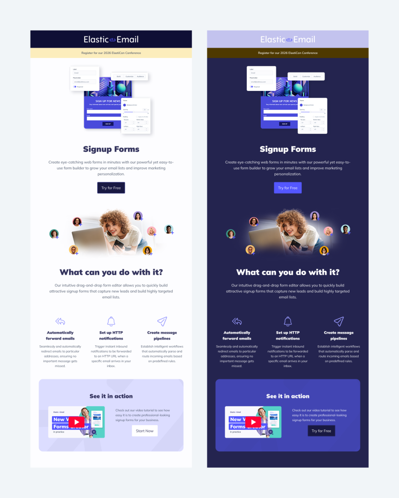
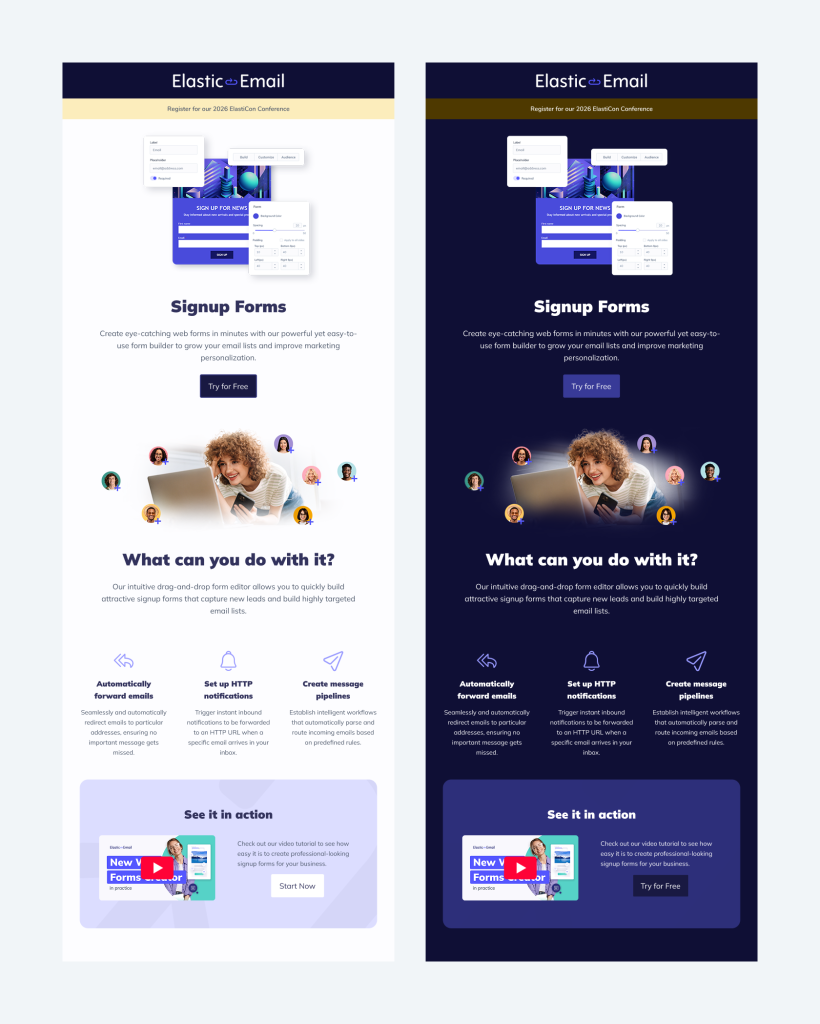
Use transparent images
When an email client inverts colors, it inverts CSS properties, but it doesn’t change your images. If your images are meant to blend into the email background, for example, a logo on a white background, switching to dark mode creates an ugly white box around them.
You can easily fix it by using PNG images with transparent backgrounds. This way, the image adapts to whatever background color the email renders on, in both light and dark mode. It is especially important for logos, icons, and any graphics that are designed to fit perfectly with the email background.
Add white strokes around dark logos
If you can’t use a transparent background or dual images, add a white outline around dark logos or dark text in images. This white border is invisible on a white background, but becomes a visible halo that keeps the logo legible when colors invert to dark. Conversely, dark logos on transparent backgrounds should have a dark stroke that is visible only when the background is light.
Avoid pure #FFFFFF and #000000
Many email clients that auto-invert colors target the extremes first. If your background is pure white (#FFFFFF) and your text is pure black (#000000), you’re giving the client the maximum reason to invert both.
A practical strategy to avoid that is to use near-white (#FEFEFE or #FDFDFD) for light backgrounds and near-black (#1A1A1A or #111111) for text. These values are close enough for visual purposes, but often deceive auto-inversion algorithms into leaving them alone. Similarly, apply this thinking to your brand colors. Midtones tend to survive inversion better than bright primary colors.
Use the dual image technique
For critical brand images where you need precise control over how they appear in dark mode, use two versions of the image, one for the light mode and one for the dark mode. Show or hide each with CSS:
<!-- Light mode image -->
<img src="logo-dark.png" class="light-mode-img" style="display: block;" />

<!-- Dark mode image -->
<img src="logo-light.png" class="dark-mode-img" style="display: none;" />

<style>
  @media (prefers-color-scheme: dark) {
    .light-mode-img { display: none !important; }
    .dark-mode-img  { display: block !important; }
  }
</style>Note that this works in clients that respect prefers-color-scheme (Apple Mail, Outlook.com, Outlook for Windows). You may still need to test separately for Gmail’s full-inversion approach.
Apply WCAG contrast standards
Accessible design and dark mode design overlap significantly. Use a contrast ratio against the background of at least 4.5:1 for normal text and 3:1 for large text, which is the WCAG AA standard. Also, test your color combinations against these ratios, both your standard and dark mode palettes. Tools like the WebAIM Contrast Checker make this straightforward.
Test everything thoroughly
You cannot treat dark mode testing as an afterthought. You need to check your emails:
- In light mode and dark mode for every major client
- On both iOS and Android devices
- In desktop clients (especially the new Outlook on Windows)
- In webmail clients (Gmail browser, Outlook.com, Yahoo Mail)
Use a dedicated email testing tool, e.g., Email on Acid, that renders previews across clients. Focus particular attention on: logo appearance, button contrast, any images with a non-transparent background, and text color on colored backgrounds.
Coding dark mode emails - the technical side
The primary CSS tool for dark mode email design is the prefers-color-scheme media query. Add it to your email's <head> and <style> section:
<meta name="color-scheme" content="light dark">

<style>
  :root {
    color-scheme: light dark;
  }

  /* Default (light mode) styles */
  body {
    background-color: #FEFEFE;
    color: #1A1A1A;
  }

  .email-wrapper {
    background-color: #FEFEFE;
  }

  .cta-button {
    background-color: #0066CC;
    color: #FFFFFF;
  }

  /* Dark mode overrides */
  @media (prefers-color-scheme: dark) {
    body {
    background-color: #1E1E1E;
      color: #E8E8E8;
    }

    .email-wrapper {
      background-color: #1E1E1E;
    }

    .cta-button {
      background-color: #4A9EFF;
      color: #0A0A0A;
    }
  }
</style>The color-scheme meta tag tells supporting clients which modes the email is designed for, helping them make better decisions about auto-inversion. The @media (prefers-color-scheme: dark) block applies your explicit dark styles in clients that support it (Apple Mail, Outlook.com, the new Outlook for Windows, and others).
You can check current client support at caniemail.com/features/css-at-media-prefers-color-scheme.
Progressive enhancement
The most robust approach to dark mode email design is progressive enhancement. You design a solid, beautiful light mode email as your base, and then layer your dark mode styles on top for clients that support prefers-color-scheme. This means clients that can't do anything intelligent with dark mode still receive a clean, on-brand email. Clients that support the media query get the full dark mode experience you designed. Gmail's auto-inversion is a separate problem that requires the image and color techniques above, as it doesn't respect your media query in most cases.
Designing dark mode emails with Elastic Email
Elastic Email provides a full set of tools that make designing, coding, and testing dark mode emails more efficient. Here's how to use them.
Using the drag-and-drop email designer
The Elastic Email Email Designer is the fastest way to build emails that render well in dark mode, even without any coding knowledge. It is available across all Elastic Email plans and products. Here are some practical guidelines:
- Choose colors intentionally - when picking background colors and text colors in the designer, select from your brand palette and consciously avoid pure white and pure black. Midtones and near-neutrals behave better under client auto-inversion.
- Upload transparent-background PNGs for logos and icons - in the image uploader, use PNG files with transparent background rather than JPEG files with solid white backgrounds.
- Preview at every stage - the email designer shows you a visual preview as you build, so check your design both as-is and by considering what would happen if backgrounds and text were swapped.
Using the HTML editor for custom dark mode styles
If you want full control over dark mode behaviour, use the HTML editor within Elastic Email. This raw code editor lets you write and edit complete HTML/CSS of your emails, including <style> blocks in the <head>.
This is where you implement the code techniques described in the previous section: adding color-scheme meta tags, writing your @media (prefers-color-scheme: dark) overrides, and setting up dual image switching. The HTML Editor gives you complete control, which is ideal for high-value sends where brand consistency across all clients matters.
Using the AI Template Designer
The Elastic Email AI Template Designer generates complete email templates from a prompt. When building templates with AI, it's worth including dark mode as a design requirement in your prompt. For example:
"Create a promotional email template for a software product. Use a white background, dark navy heading text, and a blue CTA button. Make sure logos use transparent backgrounds and avoid pure black or pure white to ensure compatibility with dark mode email clients."
The AI-generated template can then be reviewed and refined for any specific dark mode refinements, giving you a strong starting point without building from scratch.
Designing email for dark mode - conclusion
Designing email for dark mode is no longer an approach nice to practice. With over a third of emails happening in dark mode, it has become a fundamental aspect of creating emails. Without that, an email that looks broken or unreadable in dark mode is the experience a significant portion of your audience will have with your brand.
The good news is that the core dark mode techniques are learnable and repeatable. When you avoid color extremes, use transparent image backgrounds, write explicit dark mode styles, and test across clients, you can be sure your emails will display as you designed them. Elastic Email’s HTML editor, email designer, and AI Template Designer will help you build dark mode best practices into every send, without slowing down your workflow. Start with your next campaign. Check it in dark mode. You might be surprised by what your subscribers have been seeing.
FAQ about dark mode email
What is a dark mode email?
A dark mode email is an email rendered with dark backgrounds and light text, either because the email client automatically inverts the email's colors or because the sender has written explicit dark mode CSS using @media (prefers-color-scheme: dark). The result depends entirely on which client the subscriber uses and whether the sender has coded for it.
Which email clients support dark mode?
All major email clients support dark mode at the app or OS level, but they handle it differently. Apple Mail, Outlook.com, and the new Outlook for Windows respect @media (prefers-color-scheme: dark) and will apply your custom dark mode styles. Gmail on iOS performs full color inversion and ignores the media query. In turn, Gmail on Android and Outlook mobile apps apply partial inversion. Gmail desktop and Yahoo Mail generally leave the email unchanged if background colors are explicitly set in HTML.
Does dark mode affect email open rates or engagement?
Dark mode itself does not directly affect open rates, since opens are tracked at the moment of loading, before rendering is visible. However, a poorly optimized email that looks broken or unreadable in dark mode can reduce click-through rates and brand trust among subscribers who open in dark mode, which is now roughly 35% of email opens.
How do I test my emails in dark mode?
The most reliable method is to use a dedicated email testing tool such as Email on Acid or Litmus, which render previews across multiple clients and dark mode states simultaneously. You should also test manually on iOS and Android devices and in desktop clients, particularly the new Outlook on Windows. Check specifically for: logos on non-transparent backgrounds, light text on light backgrounds, button contrast, and any images that rely on a white background to look correct.
What is the difference between partial and full color inversion?
Partial inversion targets only the lightest elements: white or near-white backgrounds flip to dark, and black or near-black text flips to light. Dark elements, images, and brand colors generally do not change. Full color inversion transforms everything. Every color is mapped to its inverse, which can make intentionally dark-themed emails appear light. Gmail on iOS uses full inversion; Gmail on Android and Outlook mobile use partial inversion.
Should I use transparent PNG images in all my emails?
For logos, icons, and any graphic that is to sit against the email background, yes. A PNG with a transparent background adapts to whatever color the client renders behind it, so it looks correct in both light and dark mode. For photographs and images where the background is part of the content, a transparent background is not needed or appropriate.
Do I need to write custom CSS to support dark mode?
Not necessarily. Using transparent images, avoiding pure white and pure black, and selecting midtone brand colors will give you passive dark mode compatibility across most clients without any CSS. Writing explicit @media (prefers-color-scheme: dark) styles gives you full control over the dark mode experience in clients that support it, such as Apple Mail and Outlook.com, and is recommended for high-value sends where brand consistency matters.
Does Elastic Email support dark mode email design?
Yes. Elastic Email's drag-and-drop Email Designer lets you upload transparent PNG images, choose custom colors, and preview your email as you build. The HTML Editor gives you full access to write @media (prefers-color-scheme: dark) CSS directly in the email's <head>. The AI Template Designer can generate dark-mode-aware templates when prompted to do so.

Ula Chwesiuk
Ula is a content creator at Elastic Email. She is passionate about marketing, creative writing and language learning. Outside of work, Ula likes to travel, try new recipes and go to concerts.