You only get one chance to make a good first impression. For your new subscribers, your welcome email IS that chance.
Table of Contents
Here's what happens when you get the welcome email wrong.
The other day, I got a welcome email from a company I'd asked for information. There was only one problem: I'd signed up three weeks ago. By the time their welcome email arrived, I couldn't remember who they were, why I'd signed up, and the content didn't help me much, either. In fact, I seriously thought about marking that email as spam.
That company missed an opportunity to turn me into a lifelong customer, and it's all because they didn't get their welcome email right.
Here's why it's so important to nail the welcome email. Because that's the email your subscribers are most likely to open and read. According to Chief Marketer, the average open rate for welcome emails is around 60%. That's almost 3x the 20.81% average open rate of all emails across all the industries.
Most welcome emails are pretty short, often containing less than 150 words. But that doesn't minimize their impact. Get the welcome email wrong, and your new subscriber will head straight for that unsubscribe button. Get it right, and you can look forward to a long, mutually beneficial relationship with your new subscriber.
So, how do you get that welcome email perfect so you keep those new subscribers interested and on your list? In this article, I’ll share my tips for the perfect welcome email along with examples you can use as inspiration.
10 best practices for welcome emails
1. Use a recognizable sender
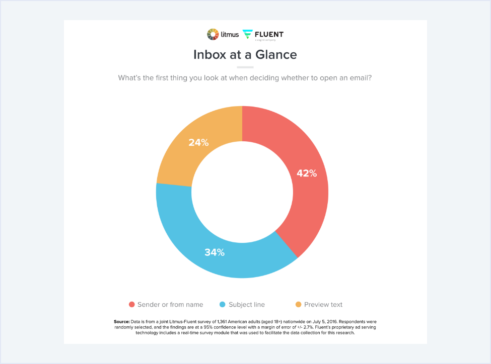
Bet you thought we were going to start with the email subject line? Well, no, because according to Litmus, 42% of people look at the sender's name first before deciding whether they'll even open the email.
You know what that means, right? When you're setting up your welcome email (or any email), take a couple of seconds to make sure that what recipients see is someone they can identify. If your name is all over your site, use that same name when you send your emails. Even if it isn't, using a real name helps make you more human and gets you past the first inbox hurdle.
These days, many businesses use the [first name] at/from [company] formula, as in the examples below:

2. Nail the Welcome Email subject line
Those same Litmus stats show that 34% of people look at the email subject line first, making it the second most important part of your welcome email. According to research, the best email subject lines are no more than 24 characters. That's not a lot of space to make people want to open your welcome email.
Many welcome emails use the [welcome to] + [company name] formula, as in these examples:

But you can also personalize the email subject line. According to Marketo, personalization boosts email open rates by 26% and click-through rates by 97%, so it's a tactic you can't ignore.
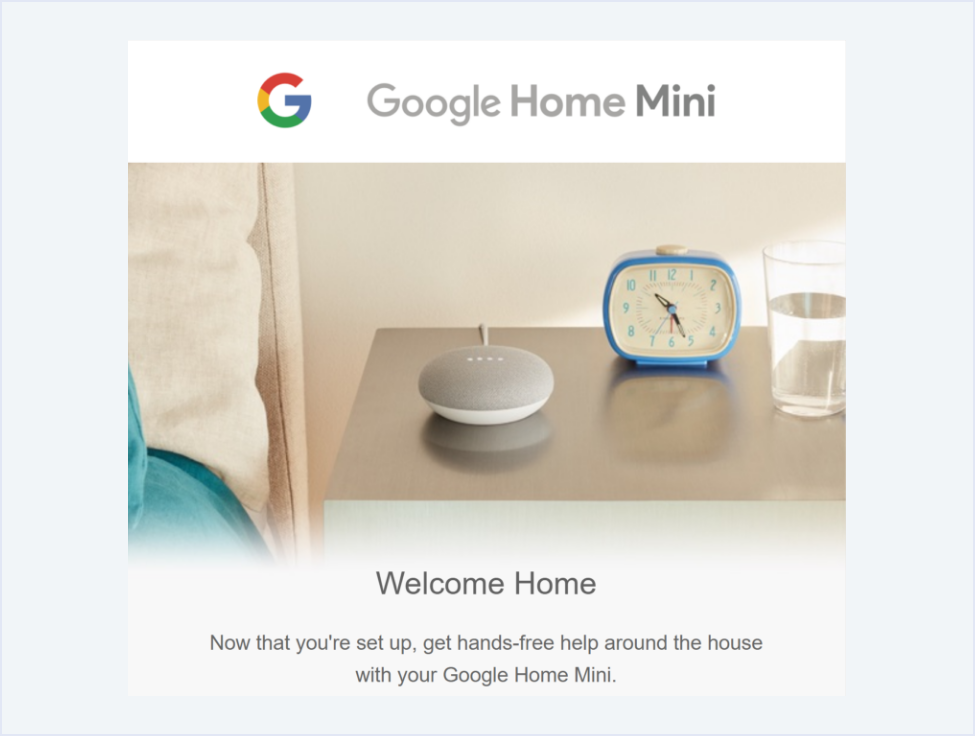
Here's an example: the subject line for this email from Google says: "Smiles Davis, welcome to your Google Home Mini".
Want more ways to create the perfect welcome email subject line? Here are a couple more techniques to try:
Ask a question that ties into people's motivation for joining your list. For example, jobs company Remote uses the subject line: "Interested in opportunities?" Tease what happens next, as NDash does with "Welcome to nDash: Important Next Steps" or try this approach from Ellevest, which uses a bit of wordplay: "You got Ellevested! Here’s what’s next."
If you create an appealing welcome email subject line, then you'll get more subscribers reading your email.
3. Greet new subscribers
So your new subscribers have opened your email—yay! Now, you've got to keep them reading.
As we've seen, personalization in the email subject line starts to build a relationship with your subscribers. You can continue that with a personalized greeting. After all, most people pay more attention when you use their name.
To do this, you'll have to collect subscribers' names as part of the sign-up process. But since the longer forms are, the more chance people won't sign up, test your forms to see if this tip works for your audience.
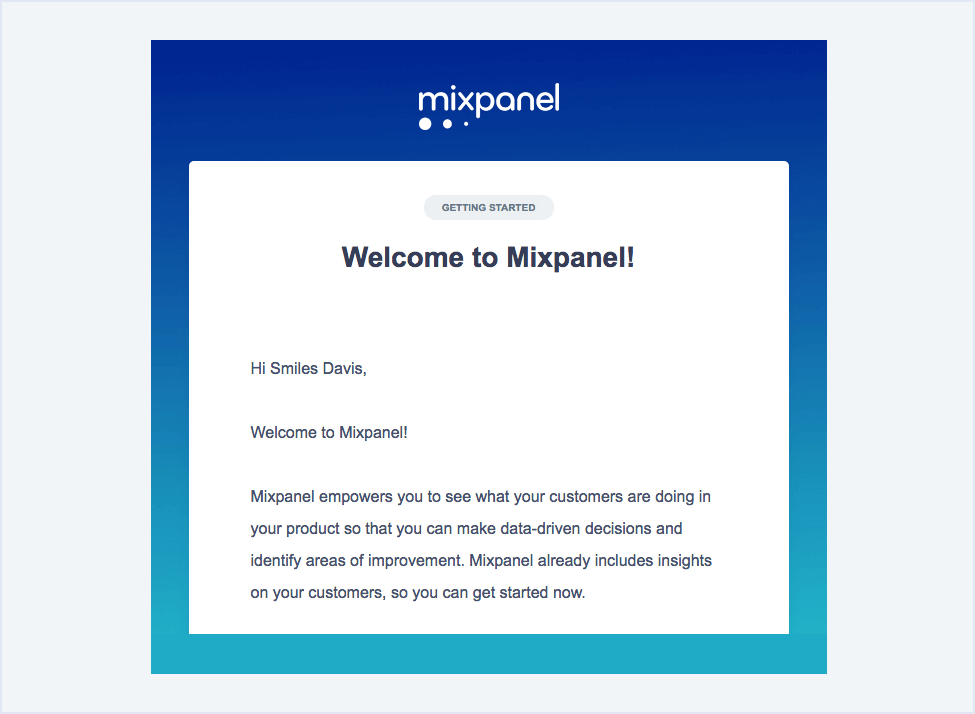
If you DO manage to collect subscribers' names, use that information to let subscribers know that you recognize them and are speaking directly to them. Which would you rather get, an impersonal "hi there" or a more personalized greeting like this one from Mixpanel:
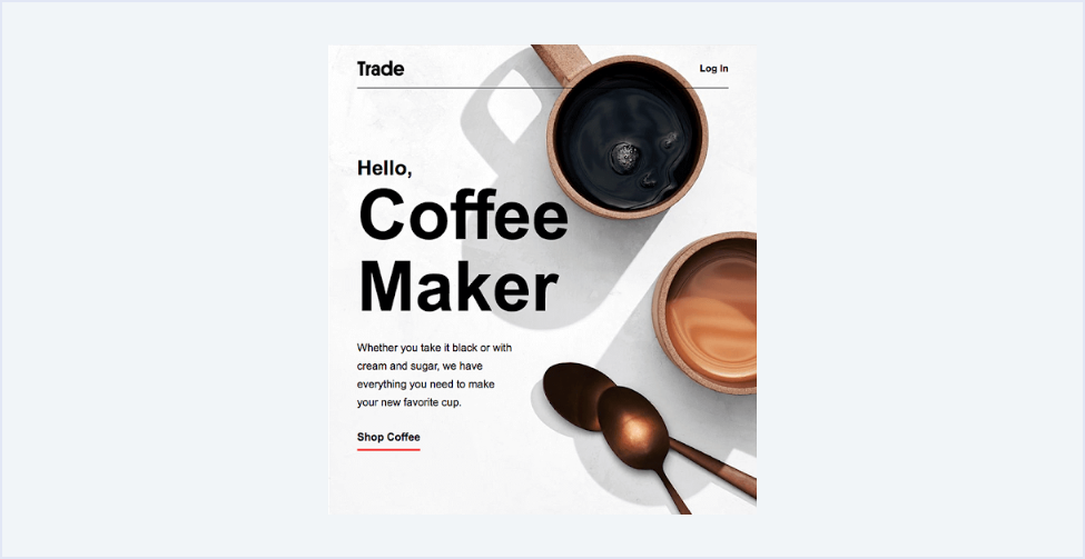
Personalization isn't just about using names, though. It's about sending the right emails to the right people at the right time. It's about identifying your subscribers as part of a group they're happy to belong to, like this email from Trade Coffee. While the greeting isn't personal, anyone who's signed up will likely be happy to be seen as a coffee lover.
4. Grab them with the first line
The first line of your welcome email is crucial to keep your new subscribers reading. A common approach is to tell them how happy you are they're there. Typical opening lines include words like "happy", "delighted", "excited" and "thrilled".
Here's an example from Havenly:

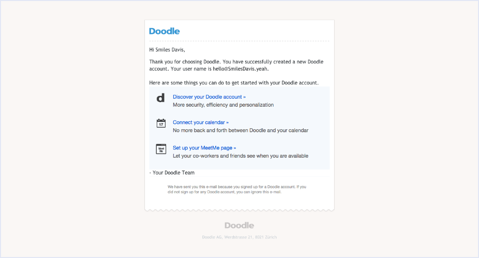
You can also simply say thanks for subscribing, as in this example from Doodle:
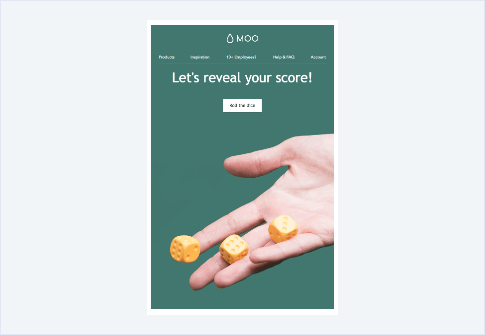
Or you could open with a teaser that gets subscribers to visit your site. Here's a great example from Moo:
The point is to start to build a bond that keeps subscribers happy.
5. Deliver what you promised
If you've promised your subscribers an incentive for signing up, like a download, cheat sheet, or evergreen lead magnet, give it to them early. That instant gratification reminds them why they signed up and keeps them interested.

But you don't want to leave it there…
6. Remind them of the benefits
With hundreds of billions of emails sent daily, you've got to make the case for why YOUR emails are the ones subscribers should open in the future. Your welcome email is the perfect place to do this. One way to achieve this is to remind them of the benefits they'll get from being on your list and using your products and services. This also helps to remind new subscribers what you do, and why they signed up.
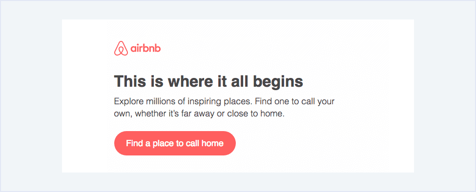
Here are a few examples. AirBnB's welcome email plays on emotions related to the concept of "home" while reminding subscribers of the benefit of using their service.
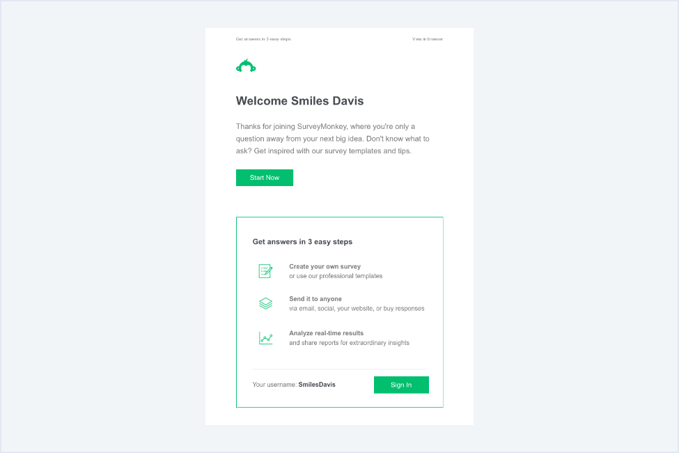
SurveyMonkey reminds subscribers of a key feature: using customizable templates to easily survey their customers:
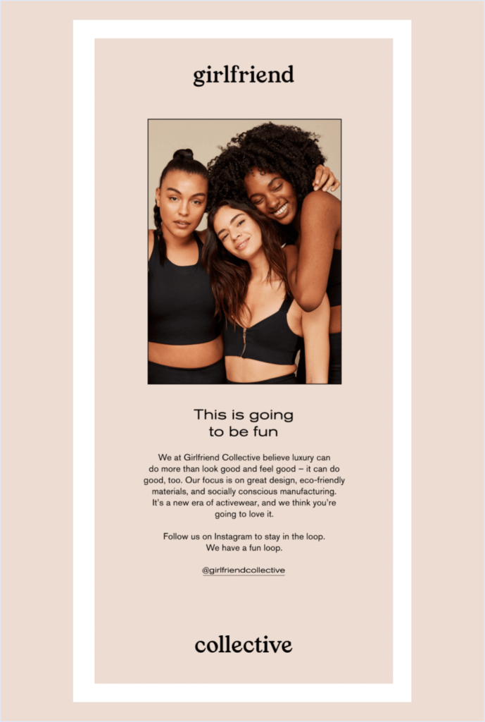
This part of the welcome email is also a really good chance to show your brand's personality. That will help turn subscribers into fans. Here's a great welcome email example from Girlfriend Collective:
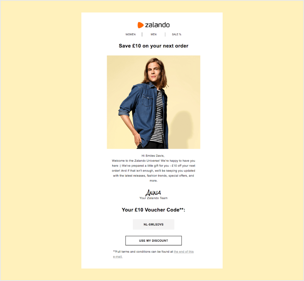
You can also wow them with an incentive for subscribing, like a discount coupon:
7. Set expectations
The perfect welcome email also lets new subscribers know what to expect from you. This includes:
-
- Type of content you'll be sending
- How often you'll be emailing
- When you publish new content
- What deals you plan to offer
-
- What actions they'll be able to take
- Type of content you'll be sending
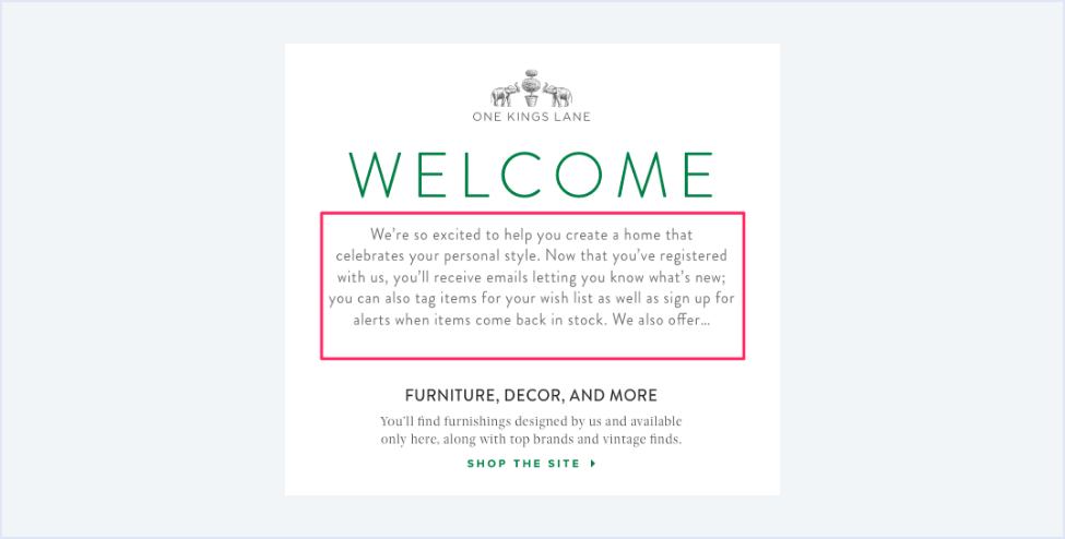
For example, this email from One King's Lane tells subscribers:
-
- They'll get information about new products
- They can sign up for alert
-
- They can add items to their wishlist from the email
- They'll get information about new products
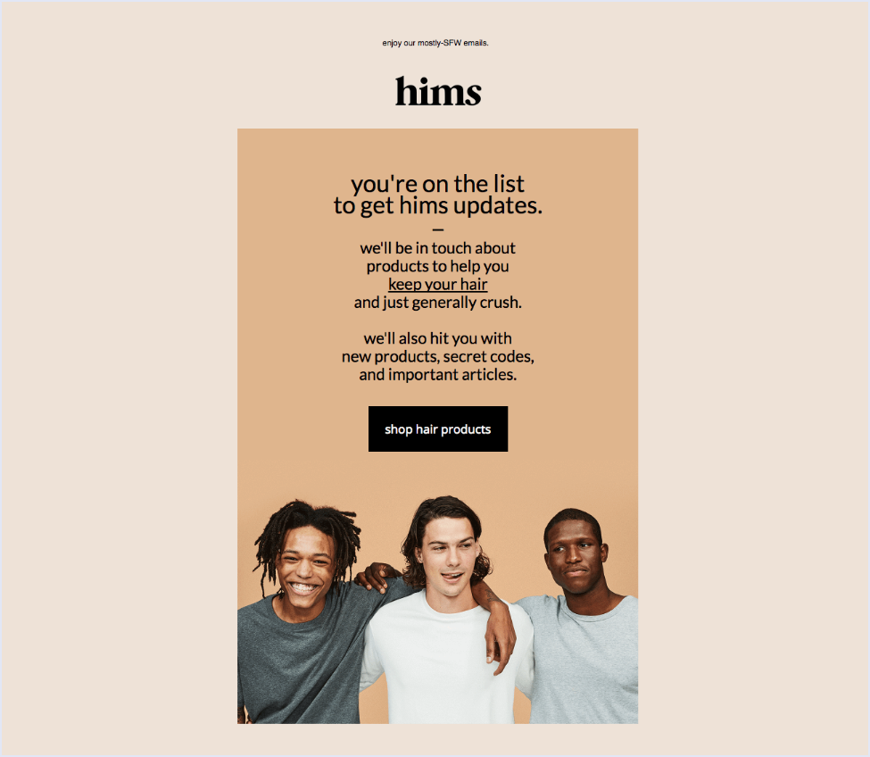
Here's another example from Hims:
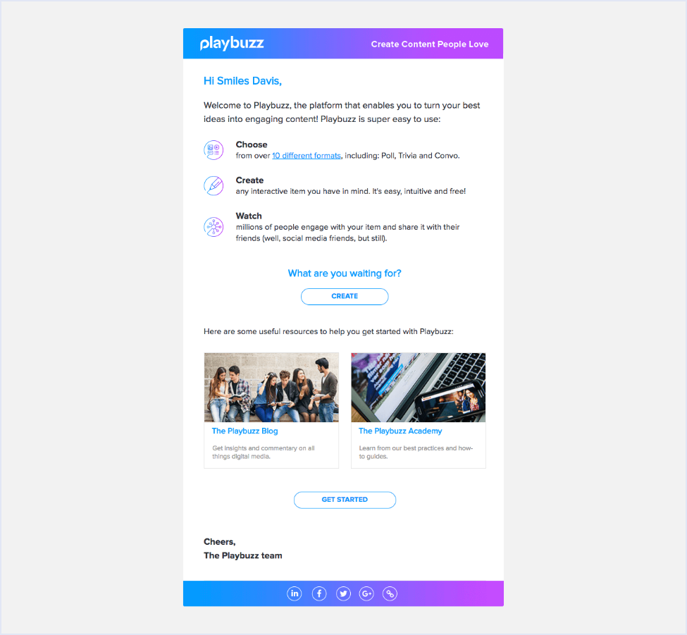
You can also give subscribers explicit next steps for using your app, product or service, like this example from Playbuzz:
You can also encourage subscribers to whitelist your email address so your emails stay out of the spam box.
8. Include an explicit CTA
A key feature of the perfect welcome email is a call-to-action (CTA). This is the single most important action you want subscribers to take after reading your email, like:
-
- Completing their profile
-
- Starting to use your product
-
- Making a purchase
The CTA is often a button within the body of the email, and may also be a link. In most emails, you'll repeat the main call to action at least twice. Here are a few examples:
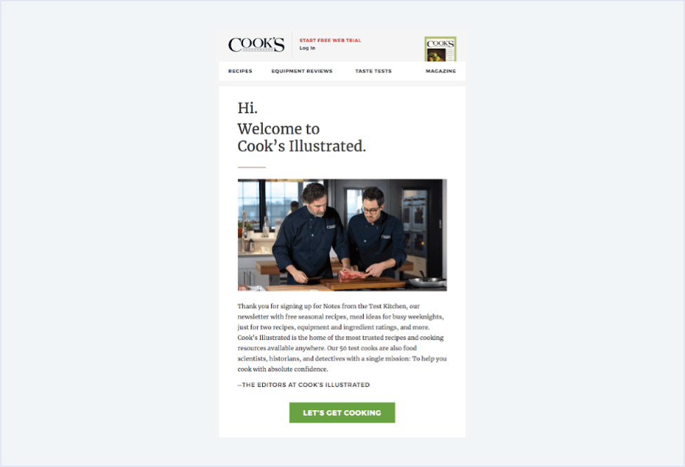
Cook's Illustrated says "Let's get cooking" to urge subscribers to start using their recipes:
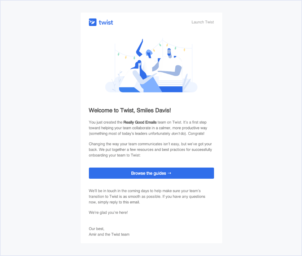
Twist invites subscribers to "browse the guides" to help them take the first steps in the onboarding process:
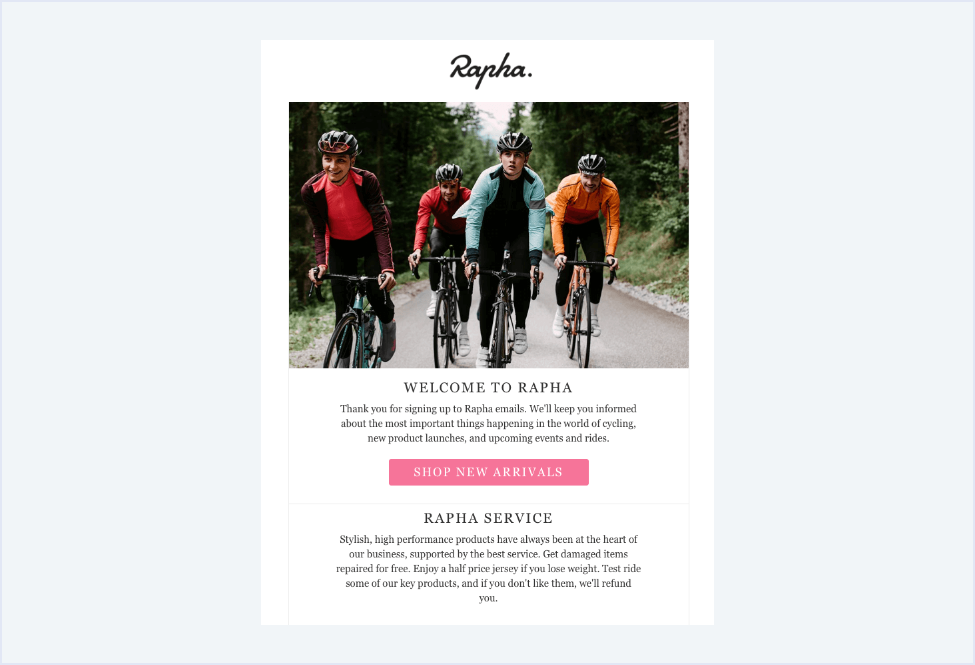
And Rapha suggests that subscribers "shop new arrivals" to invite them to make a purchase:
But, in addition to the main CTA, there's another way to entice subscribers to engage more…
9. Encourage a micro-conversion
If you want to deepen subscribers' engagement with you before they're ready to purchase, you can use your welcome email to encourage a micro-conversion.
What's a micro-conversion? A small step along the way to actual conversion. That might mean:
-
- Visiting one of your social media profiles to follow you there
-
- Grabbing another resource on your website
-
- Following a link
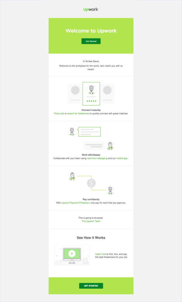
Once subscribers say "yes" mentally to one action, they'll be primed to say yes to another. That's a little bit of human psychology that's proven to work. For example, this email from Upwork offers several links subscribers can follow to start using their site.
And Asana's invitation to "celebrate with unicorns" is bound to pique some subscribers' curiosity.
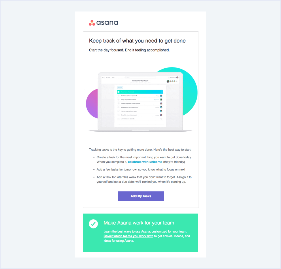
With both micro-conversions and the call to action, the simple act of clicking the link means subscribers have already deepened their engagement with your business or brand.
10. Tease future content
Human beings are naturally curious, so it's a good idea to leave subscribers with a teaser. Tell them or suggest what's coming next, and they've got a good incentive to stay on your list.
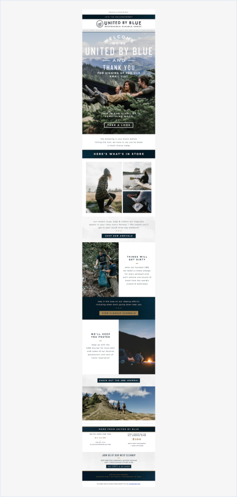
United By Blue's long welcome email shows several features and benefits they offer:
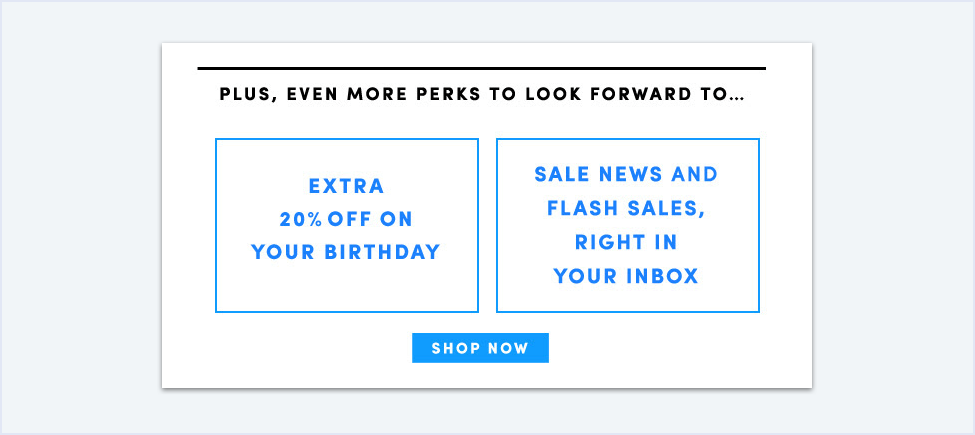
And here's another example from JCrew:
Conclusion
So that's how you create the perfect welcome email. Use these tips and examples to inspire your own first email to subscribers. Thinking that this is a lot for one email to achieve? You're right, which is why you should also consider a welcome email series.
What do you include in your welcome emails?


