Any subscribers list starts with that one first email. The main differentiator between big successful lists and lists that do not work is the way that they are created and treated.
With 3.9 billion people using emails daily and email being the preferred means of communication for 73% of millennials, email marketing is something you do not want to skip. As we strive for efficiency, the email conversion rate and the opt-in rate become our main metrics to follow. Increasing these rates even slightly will do a lot for your list and the profit that you can make from it. Below you will find many tips on how to improve your sales funnel email marketing, and as the whole topic is quite hefty, we separated it into two parts.
Table of Contents
- What is an opt-in form?
- Tips for a converting email marketing funnel
- Tips for converting emailing campaigns
- Conclusion about email marketing funnel
First, we will go into detail on how you can improve your opt-in form and then continue with tips for increasing email conversion rates. A combination of tips from both categories will make sure that you get all the subscribers you can and at the same time convert as many of them to customers as possible. With the introductions behind us, let’s start with some basics first.
What is an opt-in form?
An opt-in form is a form on your webpage that allows you to invite people to sign up to receive emails from you. So, essentially, it’s a form that allows them to “opt-in” to receive newsletters, special offers, marketing emails, news or whatever else you want to inform your subscribers about. They are great for converting visitors to leads and leads to buyers. You can use an opt-in form on:
- Your website’s home page – in a top bar, in the footer, in a sidebar
- The contact page
- Any of your website’s pages or blog posts
- Incorporated in your social media (Youtube, Facebook, etc.)
It is customary to test the performance of your opt-in forms by customizing various versions and seeing how many subscribers and conversions they get you. This is what is referred to as an A/B test. It will allow you to make larger or smaller tweaks to your opt-in forms and decide which one converts best. An optimized opt-in form combined with effective conversion rate improving helps you grow an active subscriber base and guide leads through your improved email sales funnel.
Tips for a converting email marketing funnel
Now that we’ve established why you need opt-in forms, let’s see what optimization tips for a converting email opt-in form you can use. If you would look amongst the best examples of lead generation websites, you will find a lot of common denominators. In the points below, we are going to cover them and much more!
1. Write great copy
Yeah, that won’t be easy. But, it doesn’t have to be intimidating either. The key to writing great copy is simplifying the process rather than complicating it.
We tend to think that we have to put as much in as possible to increase our chances of attracting more subscribers and leads. It’s quite the opposite. You have a much better chance of appealing to and converting your targets if you serve them a simple yet impactful message. Keep the message short and clear and focused on grabbing their attention. One thing you can do instead of trying to pack in all your product features is to focus on their benefits. People will be much more interested in what’s in it for them, and they will like it even more if you appeal to their emotions rather than their rational side.
For example, instead of saying something like ‘5 healthy and efficient fat-loss diets’, try something like ‘The 5 diets that will help you get back to feeling good about yourself’. Notice the difference?
Guides and freebies work well, but there are some examples of short copy that is right to the point. This is from Myfitnesspal:
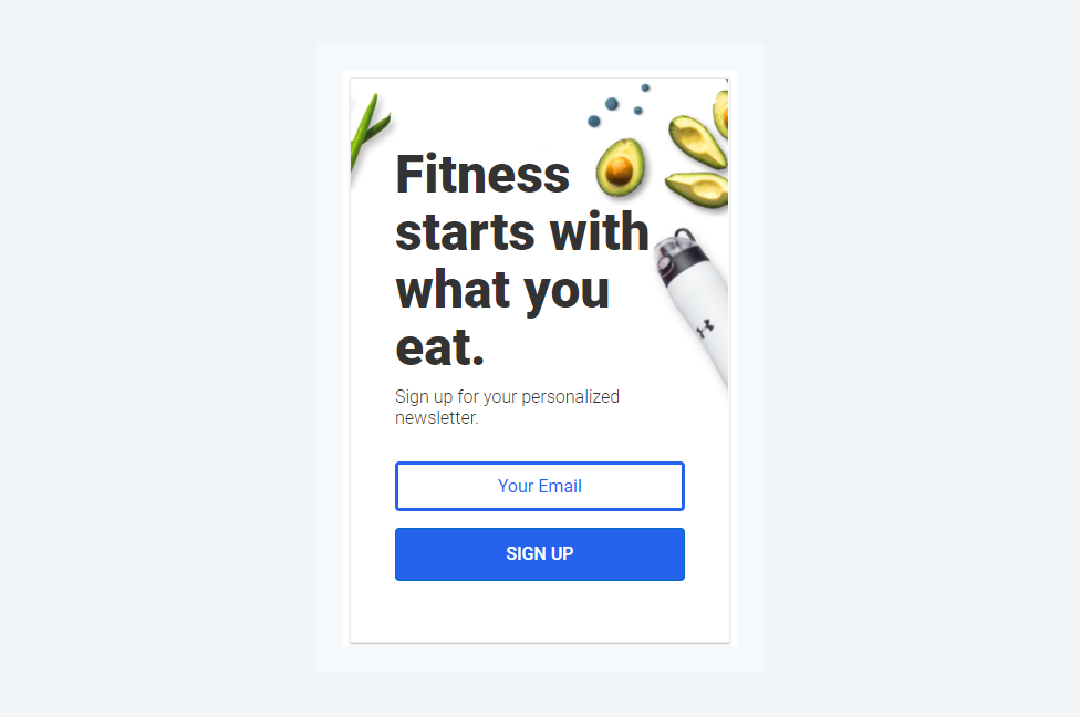
In sport, everybody knows that diet is the most important aspect. The copy speaks right to the audience. It is short, and most importantly, it is a statement to which you will say Yes. If you will check around, you will see many pages using copy that will spark a ”Yes” in you:
- Want to know about the best ways to lose fat?
- Need to save more?
- Would you like to get the best trends right in your email?
...and so on. The reasoning is obvious - if the visitor answers No in their mind, they will not sign up, so you want them to keep thinking about a “Yes”.
The secret to creating good copy is writing as if you were writing or talking to a good friend. It’s hard to write for an anonymous audience without a face. So, add a face to it. It will help you relax and find easier language to express your message more efficiently. Taking this approach to the next level would be an example from TheMiddleFingerProject.com
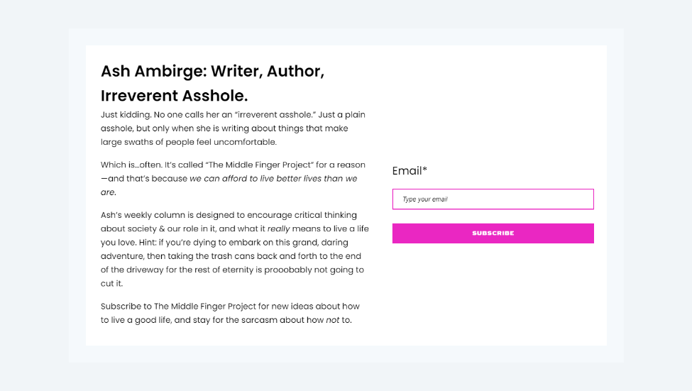
What stands out about this opt-in is, of course, the length of the text. If you start reading, the copy is quite entertaining, lays out what you can expect from the author, and most importantly, gives you reasons why you should consider signing up.
2. Do not overcomplicate
In line with the previous tip about keeping the copy simple, keep your opt-in form’s design simple too. Having many customizable options does not mean you need to use all of them. And on top of everything, you will want to avoid any clutter. Clutter is an issue as it distracts from the main message and idea.
Choose no more than 2-3 fonts, no more than 2-3 colors and don’t be afraid of whitespace. Whitespace is your friend. Keep the colors in line with your brand’s colors and use design hierarchy tips to improve your opt-in form’s appeal and conversion potential.
This is an example from MakingSenseofCents, one of the biggest blogs about personal finance:
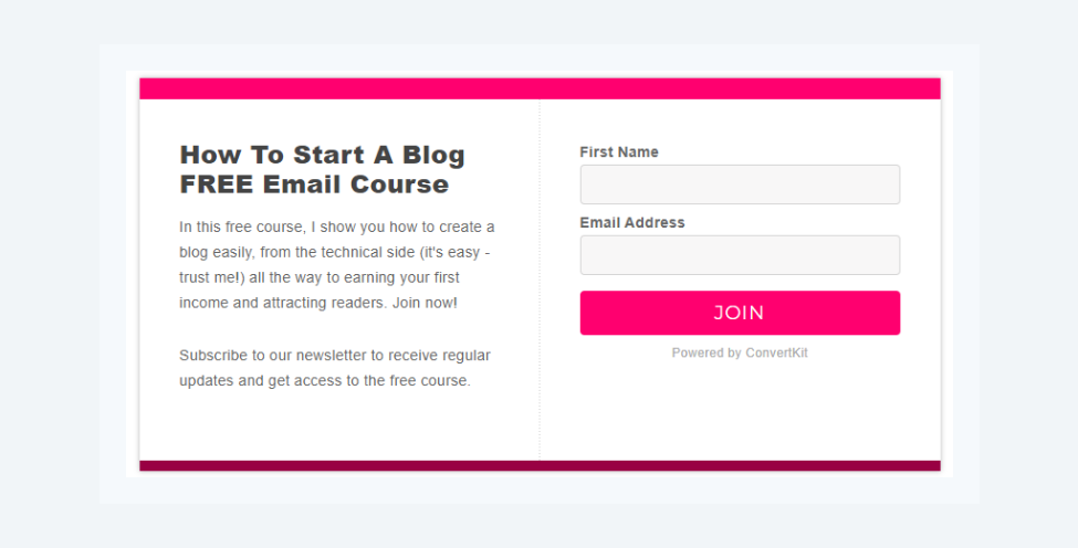
Two fonts, two colors. That is all that it takes to have a converting design. There is one contrarian school of thought that might be applicable in some cases. If you are looking to make your optin form visually dominant, make it ugly on purpose.
The goal of the form is to convert and to convert, it has to draw attention. If your line of business allows it, you can see for yourself how an ugly, overcolored form will do in A/B testing.
3. Optimize the number of form fields
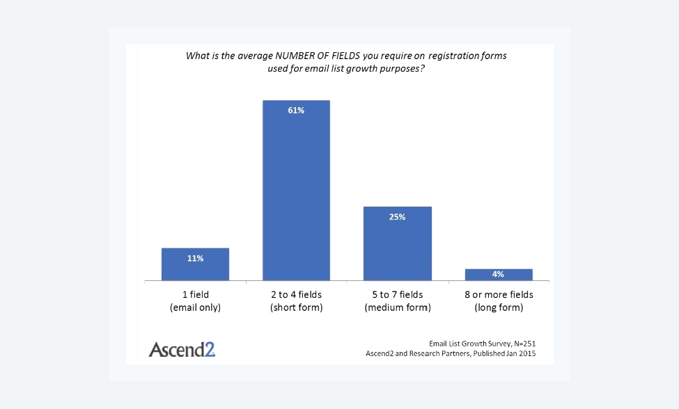
Another aspect that can make or break the conversions you expect to get from your opt-in form is the number of form fields. You will want to make things as uncomplicated as possible here too. It is good practice to use between 2 and 4 form fields for your opt-in to get maximum results. Don’t ask for additional information that you won’t use anyway. Make it easy and fast for users to fill in the forms and hit the CTA button.
Each additional field will drop your conversions, that is why according to Ascend2 Survey most companies use 2-4 fields:
Another feature that will help users fill in the form fields is using ghost text. Ghost text is the less visible text inside the form field that guides users to correctly fill in the form. This way, users will know exactly what is expected of them, and you will get the information you need.
The so-called short vs. long optin form is a matter of your conversion goals. If you just want to send out emails, a short form with two fields will be enough. But if you are looking to generate “qualified leads”, you may want to go the “long optin form route”. Your conversions will be lower, but you won’t be just gathering emails, you will be generating qualified leads.
4. Make the CTA button pop
It’s paramount to get the CTA button right to get as many subscribers as possible from your opt-in form. Using something like ‘subscribe’ is a little too bland. It won’t attract or convert many people. To peak user interest, try to experiment with different options. Use some humor, get more personal, and always use action words. Go back to the idea of talking to a good friend. You wouldn’t tell them to just "sign up". You would add a cherry to that cake. This is nicely proven by a study from Hubspot:
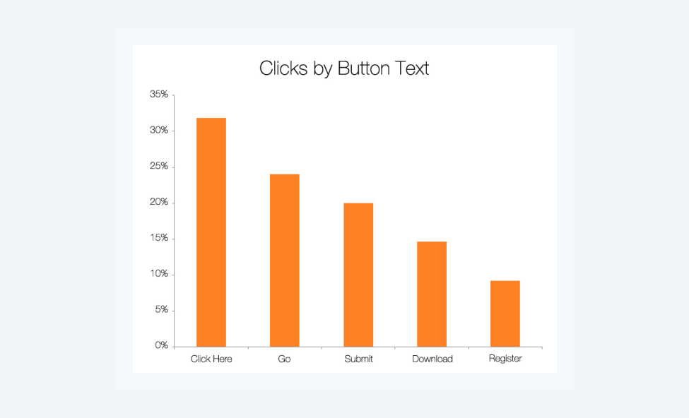
As you can see, more friendly terms (like Click Here and Go) have higher conversion rates than directions that look like an order. While you can experiment with “Download, Join Us, Subscribe, Yes!, Get It Now!” etc., keep in mind that the visual side of the button is of critical importance.
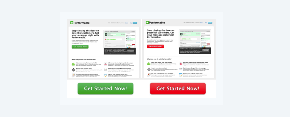
Hubspot conducted a test where it found out that the red button performed better by 21%. There may be two reasons behind this:
- Red is a more aggressive color, a “warm” color. Warm colors tend to perform better and as a call to action, it is more appropriate than “calm” colors like blue, green or yellow.
- In this case, red is in contrast to the overall theme of the page (which is green), making it more noticeable.
5. Emphasize the benefits
We all have hundreds of emails in our inbox that we haven’t read or moved them to spam. With so many businesses and websites asking for your email, the inbox can get crowded. For this reason, or simply because they are very strict with disclosing personal information, most people will think twice before giving you their email.
To make up for that, you will need to be ready to offer them something in return. It can be a great value like industry tips and tricks, an exclusive discount or a special subscriber offer. Instead of writing just ‘Subscribe to our newsletter’, try something more appealing like ‘Subscribe to get the latest news and get exclusive discounts’.
Many brands have opt-in forms that offer downloadable specialized content in exchange for user emails. Instead of just inviting visitors to subscribe, they offer access to templates, online courses, webinars, or cheat sheets. No matter what it is, make sure your opt-in form makes the benefits clear to users. An interesting study was prepared by Beem Digital:
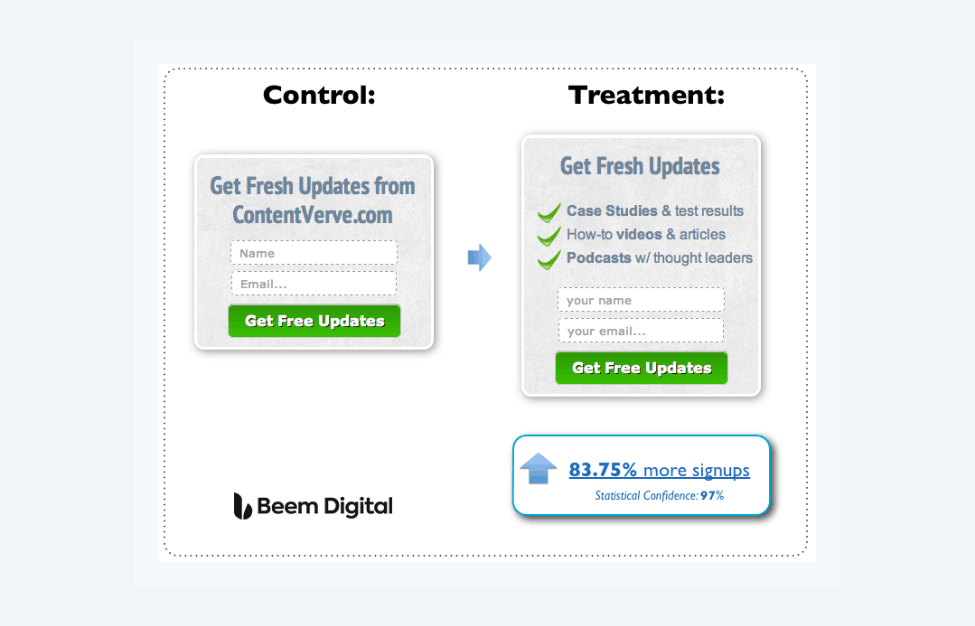
It is unclear on which number of email subscribers this was tested, but it illustrates the point. Even just looking at these two options, the second one looks more appealing as it has reasons to join rather than just a call to action.
6. Add social proof
If you already have a good number of subscribers, it’s a good idea to flash that. Showing that many other people have entrusted you with their email will make others more likely to do the same.
Just like good reviews can attract more customers, having an opt-in form that mentions how many other subscribers have made a choice you are asking the user to make, will show that many others trust you so why not them too? Adding something like ‘join our 10,000 followers’ will also give them a sense of becoming a part of a community. It makes conversion a win-win situation.
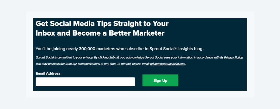
This example comes from Sproutsocial.com, while it adheres to the other tips from this post - to illustrate the point, the most important is that second sentence. You can read it as “300,000 marketers are already getting the insights while I am not getting them, therefore I am missing out. They know something I do not know. “
7. No spam, equals no subscribers
This is what we can call a “clickbait” title. But fun aside, there are some words and phrases that will get your conversions killed - like “We respect your privacy” or “We won’t SPAM You”. The visitors were not even thinking that their privacy might be violated or that you might spam them, and now you reminded them that it is possible. It is similar to suddenly, out of nowhere, saying “I Promise I will not kill anybody”.
Research by Michael Aagaard, confirms this:
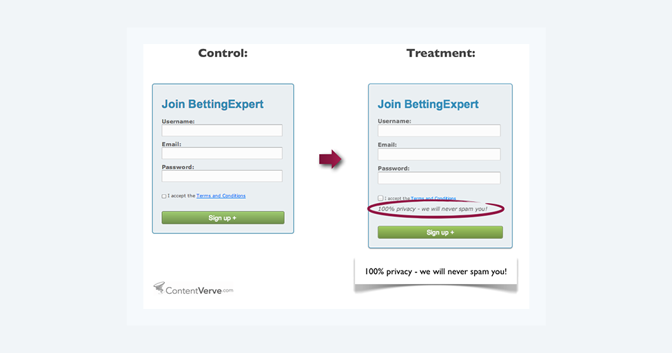
The experiment as you see above had surprising results. After adding the 100% Privacy - we will never spam you, the conversions dropped by 18.7%. So less is more in the case of converting email optins.
Tips for converting emailing campaigns
Optin forms are critical for the success of your email campaign, but that is just half of the battle. Now you have to make sure that you consistently convert your newly gained subscribers into clients. In this section, we will share a couple of tips on how to make sure that the second part of your email funnel is working as it should!
8. Automate but personalize
Efficiency is not just about sending out hundreds of emails, it is also about the engagement of your subscribers. Personalization matters as it will catch the attention of the recipient. If your optin form was only collecting emails, sure there is not much that you can personalize, but if you were collecting names also - that is a start.
Hi John, or Dear John, will increase your CTR notably. People like to hear their name. Use it in the beginning (as that is what the recipient will see in their preview) and in the body of the email to keep the recipient engaged.
9. Write as if you’re writing to a friend
Whenever you are writing and improving an email sales funnel or just an email blast, make sure to sound as if you know the subscriber. Do not be too formal. The friendly style is much more engaging and readable than formal polished phrases. To achieve a “friendly sounding” email, when you are writing it, try to imagine that you are writing to a good friend - a person that you know. But at the same time, keep in mind your customer profile.
A combination of these two thoughts should project into an email sales copy that will be both readable and will lead to the outcome that you are looking for.
10. Delay the sale
Do not rush the sale. After you get the subscriber to your email list, do not push the sale immediately. While you may get some conversions here and there, you will lose a big chunk of potential sales because you did not establish a relationship with your subscriber.
The best way to do so is to provide value. Things that may seem obvious to you could be a revelation to many of your readers. Share valuable information with them day after day. The value that you provide may come in various forms. It can be a free roundup of the best concept sources in your niche, a recording of a webinar you did earlier, a short guide or FAQ on a popular question in your niche, etc.
There are two aspects to this approach. First, you are establishing your authority. You are showing to your audience that you know what you are talking about and you are not afraid to share it. So when you decide to convert, your list will have more trust in the products that you are trying to sell. The second reason is that you will change the perception of the recipients in your favor. The goal is to make your subscribers think that since you gave out so much value for free, the paid product must be even better. It is of course crucial to deliver on this unspoken promise.
11. Simplify the design
Plain black text on a white background is the way to go. Do not try overly complicated designs with the hope that they will somehow get attention. There are two drawbacks to making your layout more complicated than it could be. First of all your actual message may get lost in various pictures and colors. You are sending your email with a particular goal in mind so keep the focus of your readers on that goal.
The second reason is that with every additional link or picture, you are increasing the probability that your email will not get delivered at all. Your goal is maximum deliverability and conversions. So focus on that and achieve that goal with copywriting rather than unnecessary design.
12. Make a catchy subject line
Yeah, and the water is wet. We know. But there is a very thin line between clickbait that will get you to spam flagged into oblivion and a high CTR subject line that will get your open rates higher. First, some examples of how NOT to do it. If you put into the subject “Your Purchase”, “Order N12345”, “Re.: As We Discussed” - the recipient will open your email. Also, it will be the last time they do so before they unsubscribe or flag you for spam.
Now, a much better example would be putting in a headline a relevant topic or an issue that your audience is facing. We could write “Need More Conversions?” and lead you to this post. This is both relevant to problems that our audience is trying to solve and also reflects the insides of the email. Personalization works great in the subject line, “Hi {name} - offer for {company}” the open rates will be increased as everybody will want to know what the offer might be.
But what do you do when you do not have enough data for such personalization? “Quick question?”, “Your thoughts?”, “Your Feedback?” - can work well while still being on that ok side in terms of clickbait.
13. Follow-up
It is estimated that nearly 80% of sales are a result of 5 follow-ups. So if you send out your perfectly crafted sales email and get no conversion, do not get discouraged. In improving your email sales funnel, you should be building up towards a sale. After you used the first few emails to establish your authority and relationship with the subscribers, it is time for the sales email.
But even after you send out your sales email, the sales process does not end. Have a mechanism in place that will separate the ones who took action from those who did not (subscriber tagging for example). When this is done and the first wave of buyers has already made a purchase, give it a day or two and remind the second group of the CTA. Some subscribers are ready to make a purchase, some will need more time and relationship building to make that happen. Just remember that it takes more than one email to make sure that you converted the maximum possible share of your list.
14. Increase deliverability
Your copy can be the most converting in the history of sales, but if your emails are not getting delivered, you have a problem. There are some simple steps that you can follow to make sure that you are getting inboxed as much as possible.
- From time to time, make sure that your domain is not on any spam blacklists. There are many online tools - for example, MXToolbox.
- If you just bought the domain, do not blast 100 emails a day. Start slowly at 20-25 emails that will be spread out through the day and in 3-4 weeks increase it.
- Minimize the use of words like free, make money, buy, call now, act now, unlimited and others. They act as a red flag for spam filters.
- Make unsubscribing as easy as possible. But do not forget to use an exit page to catch those who acted in the heat of the moment and may still be interested in your emails.
Though there is of course much more to it, these basic tips will do a lot to make sure that the reputation of your domain remains on a good level.
Conclusion about email marketing funnel
With all these tips, there is a lot for you to test. That is also the essence of conversion funnel email marketing improvement, testing.
While you may see good results, they can always be even better. Keep in mind that even the slightest change in your subject line may have a major impact on the overall Open rate or the fact that a few sentences in your copy may double the sales, or decrease them. These immediate results and endless testing possibilities will drive the success of improving your email sales funnel.


