Every year new email design ideas emerge making you rethink your whole email formats.
It’s not an easy task, as you need to consider your brand, audience, and the pros and cons. You need to choose the best email designs that will tick all the checkboxes and will fit your current formats as well. After all, you can’t just completely switch the design of your emails without transitioning or at least giving a heads up. Otherwise, your recipients will not only be surprised, but they might also react negatively to the rapid change.
Table of Contents
At the same time, not changing your email designs at all can result in people calling your brand “outdated” or “old-fashioned”. So, unless you run a “boring” business, you need to update your email templates regularly.
But asking yourself whenever switching up your design is worth the hassle is only the tip of the iceberg. You need to actually decide on a trend or trends and implement it in an eye-pleasing fashion. And let me tell you, this is not an easy task. Choosing trends, figuring out how to match them and make them look nice is a tough task. Luckily for you, we’ve done most of the work here! We created 3 beautiful email templates and dissected them so you can see how each of the 2020 design trends works on creating a whole picture.
3 email design trends of 2020
1. Go bold and go simple
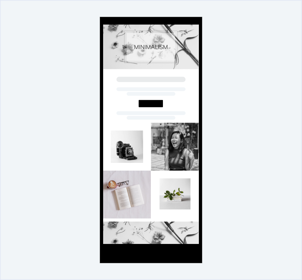
Monochrome is so in right now. Everybody is tired of loud, intense colors that strain your eyes. That’s why black and white emails tend to stand out as calming and far more eye-catching than the usual emails. You might think that the monochrome palette is constricting but having only two colors on the opposite sides can inspire you to create truly out-of-the-box ideas, play with tones, negative space, and bold patterns. Because the email is so simple, you can really go all out with graphics or typography. You can also embrace simplicity and try to make your email look as clean and minimalistic as possible.
Speaking of minimalism, it’s a trend that translates well into pretty much every aspect of life. Emails are no different. Instead of packing content and eye-catching designs in your email, opt for a more simplistic approach without any unnecessary clutter. You can even treat email as an invitation to explore your business, making it as short and simple as possible. Then, by creating a dedicated landing page you can explore the subject, making it a truly immersive experience for the recipient. It works especially well for seasonal promotions, interactive content, or non-profit organizations.
Collages might be a thing of the past in social media but they are alive and well in the email community. In the world where the attention span is dropping, you need to find a way to engage customers within the first 8 seconds of them opening an email. What better way to do so than by creating a set of pictures that you can sneakily turn into working links?
In the filmmaking industry, this technique is called “show, don’t tell”. It means that the less that is actually said, the more the audience is able to see. So instead of giving them a wall of text and some filler pictures, you let the graphic build up a story and allow recipients to react to it. However, if you feel like standalone pictures might have a hard time engaging your audience, you still can add a simple CTA over the graphic. It will guide the recipient to click on the picture that will transfer them to a specific website while still maintaining this minimalistic feel.
Finally, everybody knows about optimizing for mobile. But the new upcoming trend that will soon (if not already) be a staple in every email design is dark mode. Nowadays, you need to optimize for the dark mode to cater to your audience. Take into consideration that various email clients have different dark mode settings. You need to test your emails to perfection until you are really sure that it looks great. Take a hint from us - monochrome emails translate very well into dark mode.
2. Break the mold
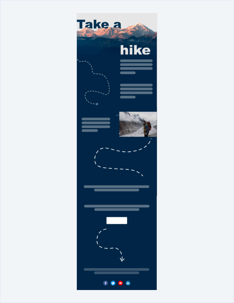
Email format is so much more than just your typical: picture - text - button. The newest trend is more free-flowing, allowing the content of the email to warp and shift. There are no more clear boundaries you need to follow. So go wild! With a little bit of creativity, you can change the shape of an email and even add a guide that people will naturally follow. Take a look at the example above where pictures with transparent backgrounds form a line through the whole length of an email. In the recipient’s eyes, they are not considered separate entities, but something that is an integral part of the background. They instinctively follow it right to the button and are more inclined to take action.
Here’s the tricky part though. If you’re using a guided technique, you need to make it smart and consistent with the rest of the email. If you add a flashy arrow where the recipient is supposed to click, they might feel offended. Give them the benefit of the doubt and let them play with the design a little bit.
This is a simpler approach to email interactivity that is a big thing right now. Not everybody has the means to create a carousel in email, add a game within the email body or make a working survey. Using pictures and text in a creative way can be a great substitute for it, which will also have a shorter loading time.
Within this trend, there is an additional element that is playing with perspective. Take a look at the header of the example above. Do you see how one part of the text is hidden in the background, while the other is in the foreground? That’s another example of creatively playing with depth and making an email look more interesting.
The final email design trend that we need to mention is colors. In an email, colors are a very important element as they are the first thing people notice and judge accordingly. Too dark of an email can bring negative emotions, too bland will be easily forgotten. You need to find a happy balance that will please your recipients. Furthermore, creating a palette is no easy task. You need to match colors that will complement each other and will also have a modern feel. Sure, you can throw something together from the color wheel or take one color and just change it’s tone a little bit, but that’s not really gonna cut it.
What you can do is follow the masters of color creation - Pantone. Each year they announce a color of the year and create sets of complementary colors that you can use in your emails. This is the safest bet when it comes to creating a sleek, in-style email palette. In our example, we took the “Ponder” palette to show you just how nice it translates to a message format. Don’t be afraid to experiment with the colors and darker shades. Remember that you always can test your emails to see what people like.
I mentioned bending the boundaries on an email already and there is another email design trend that compliments it well. It’s a gradient. Creating seamless transitions between pictures and backgrounds or between two different pictures makes an email look whole and cohesive. It allows you to take a more creative approach with your graphic choices and it’s just as clean to look at as a simple white-on-white email.
3. Love all shapes and sizes
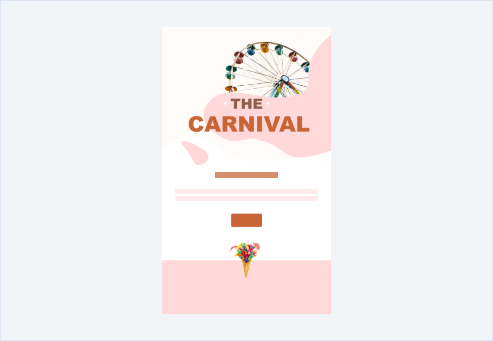
Do you want your email to stand out? One of the top email design trends is playing with typography. It’s a sure way to quickly get your recipients’ attention. Let yourself experiment with different shades, adding some elements, or making it look 3D. This is one of the first things that recipients see so your job is to make it catch their eye so they will scroll further down. Currently, very on-trend are simple free fonts with a modern flare. So instead of making an overly fancy CTA with lots of swirls and a romantic feel, create something simple but bold.
Speaking of bold, it’s best you ditch the fluorescent colors. The newest trends are muted color palettes that are easy on the eyes and usually very complimentary of each other. So if you have an intense shade you want to use, think twice. Maybe it’s better to take down saturation just a little bit to make it feel more muted. Furthermore, some of the most popular shades are browns and greens, giving emails a more natural, organic look. Again, check Pantone for inspiration for your muted email design palette and experiment with different shades to make that perfect group of colors for your next campaign.
Next on the best email designs of this year is directly related to an organic feel. Everyone seems to be more in tune with nature and embracing imperfections, which means that there is no more room for harsh lines and blocky structure. Your graphic can have all different kinds of shapes that will look hand-drawn and soft. Embrace this to make your emails look incredibly trendy.
On that note, if you still want to have this modern flare, consider implementing mixed media in your email body. It’s a creative way to tackle the hard lines of the photos with the new approach of a seamless email structure. By combining the photos and graphic design, you can easily make your email pop without it looking tacky. Just look at the example above. Thanks to the mixed media visible throughout the email, the message feels cohesive and interesting. If there was only a picture or just the shapes it wouldn’t be as memorable.
Get to work on your email designs
You know about the most popular email design trends of 2020. Now all you need to do is to implement them in your upcoming campaigns. However, we get it that making so many changes can be a daunting task. Sometimes it’s nice to have a guide. That’s why all the designs you saw in this article are available in our Template Gallery!
So don’t wait and start using them to elevate your email marketing campaigns now.
If you have any questions, reach out to our Customer Success Team available for you 24/7.


