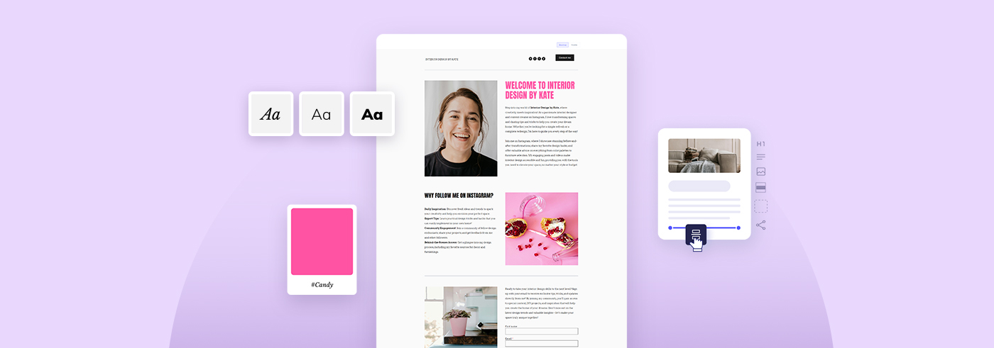
Whether you've been with Elastic Email for a long time or you are just starting your email journey with us, we have breaking news coming. We are very excited to introduce to you an upgraded version of our Elastic Email app!
Table of Contents
- Winds of change
- New interface, the same well-known features
- Enhanced product views
- Completely new Account dashboard
- More is yet to come
Winds of change
If you are wondering what Elastic Email has been up to recently and where we are heading now, there has been a lot going on. We’ve made plenty of investments in advancing the technology in our product. Over the last year we’ve established a few new features, improved some of the existing ones and added new screen layouts, but there was much more happening behind the scenes! We were working step by step on a completely upgraded user interface. We’ve rebuilt our UI from the ground up with a new technology stack to ensure better system stability, better email delivery and an even better user experience. The appearance of the new Elastic Email app is just the icing on the cake of all the changes we’ve introduced.
New interface, the same well-known features
So what exactly has changed? First, the new user interface is actually a completely new and stand-alone application. It is placed under the new web address app.elasticemail.com. To log in to the new application, everyone can use the following login link or just click on any of the “Log in'' buttons located on our website.
If you are a new user of Elastic Email (signed up after the 12th of July 2022), the new app will be your one and only version of the application available so there is no way you will get lost.
On the other hand, existing users will have the ability to switch back to the older version if required.
The new version is completely backwards compatible. All your previous settings, features and pricing plan remain unchanged until you decide otherwise. Also, you keep the ability to upgrade plans and purchase add-ons as usual. In other words, you can switch back and still keep using the most recent version of our application, but the new one really has all of the bells and whistles you already know.
Enhanced product views
By and large, the most significant interface change comes with the navigation and usability of the new Elastic Email app. We decided to keep our products, Email Marketing, Email API and Creator Suite, divided into stand-alone entities. This means that, depending on your product and pricing plan of choice, you get a different version of the interface and a different menu containing only features and settings intended for you.
There are a couple of benefits of this solution. Every user keeps a tailor-made, stripped of unnecessary content, simplified and modernized interface with the tools one actually needs and pays for. We have also redesigned the menu items a bit and some of them, from now on, are nicely grouped. For example, if you would like to grow or manage your audience by building some signup forms or uploading new contacts, you will find these features under the Audience category.
We know that you value how easily you can access your favorite features. That is why we haven’t changed so much here. But still, you can see the same quality with an even more enhanced experience. Also, because we want to give you as seamless software experience as possible with everything running smoothly, the new app works faster with the new technology implemented and the more stable system behind it. Time is a meaningful factor to all of us. For that reason, we do our best to help you achieve your goals as quickly and easily as possible.
Completely new Account dashboard
If you already had a chance to dive into the new version of the app, you probably noticed that we’ve also separated your account settings into the new Account dashboard. To this new command center, we’ve moved all of the global settings that affect your whole account. To get there, you have to click your profile name in the lower left corner and then choose Account.
What you will find there are your Profile settings, all the Billing details and Security settings. In your Account menu, you will also find a shortcut to the Help center and all the settings for managing additional Users, Subaccounts and Custom branding (if your plan includes them). As a result, you get everything gathered in one place and arranged with the new user interface.
More is yet to come
These changes will improve your whole user experience and comfort of working with our software on a daily basis. They also set the stage for us to add new and exciting features in the coming months. Today we are celebrating the completion of the very complex and challenging project that we’ve all dedicated a lot of work to. We are really proud of the results, and we believe you will like them too!
We also hope that you’ve already felt this wind of change, and you will start to benefit from it soon. The new application opens up new opportunities for all of us. So now, be ready for more updates, improvements and new features! And of course, if you would like to leave your feedback, it is always more than welcome. Feel free to share all your suggestions and the wholly new app experience with us. You can do it through the Feedback widget in the application or by contacting our Customer Support Team.


